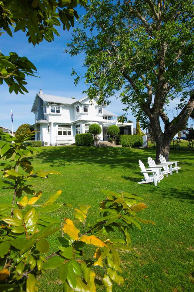
Why decorating the house involves more than slapping paint on the walls.
One of the most daunting jobs around the house can be choosing the right colour for the rooms in your home.
And the exercise is not as simple as picking your favourite hues and haphazardly slapping paint onto the walls says Resene colour consultant Sarah Gregory.
Instead, she says, choosing colours involves many decisions because different colours evoke different emotions in people: Is the room going to be used for relaxing or for activities; what is the relationship between each colour (as colour is affected by the colour next to it); how much natural light comes in to a room (light changes the perception of colour)?
Start your property search
“Not only that, these days we’re confronted with literally thousands of paint colours from which to choose. Confusing, right? Actually there are a few tricks to help make shopping for colour easier.”
Gregory’s first suggestion is to create a mood board or scrapbook incorporating colour swatches, wallpaper samples and clippings from magazines.
“I always suggest people have a look through interior magazines and on the web to get some ideas together so they actually know where they are going,” she says. “Then I suggest they come down to a Resene ColorShop and just stand in front of a colour palette.
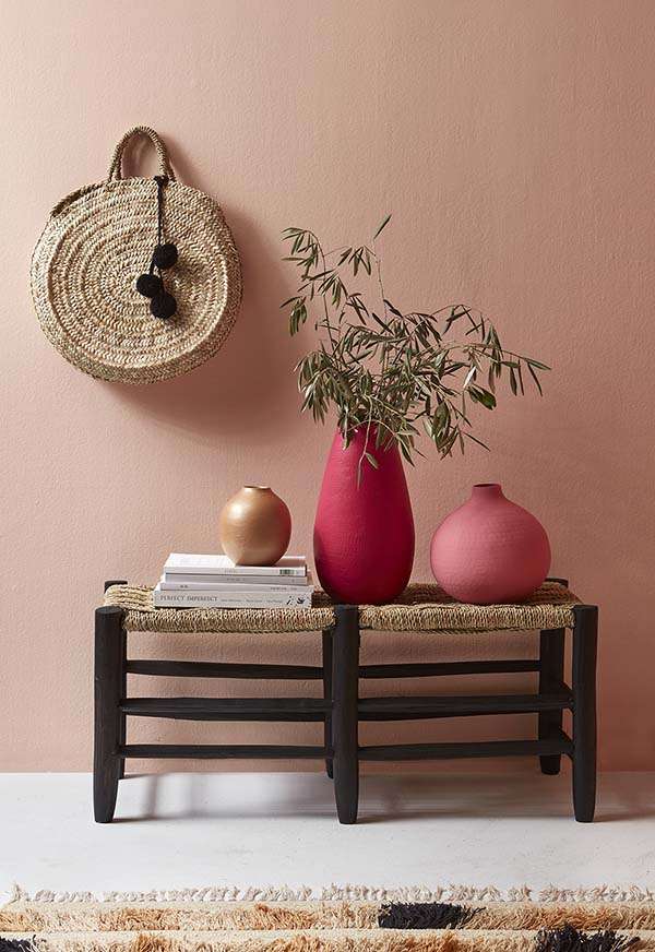
Resene FX Rose Gold metallic on the vase is part of a new wave of on trend colours, paired with a Resene Just Dance wall. picture / supplied
“Generally people are drawn towards one colour group like blues or greens or reds. Even if they don’t really know what they like, if they just spend some time looking they generally get pulled one way or another.”
Gregory says it is important to test colour first - especially if colours such as show-off purples or racy reds are picked.
The best way to determine how natural light will affect those chosen is to test them in the room they’re destined for: “Artificial light can really throw something especially with the neutrals because they’ve got so many undertones and sometimes they don’t show until the evening light hits them.
“Take some Resene testpots and try them out at home,” she says. “But don’t paint them on the wall, paint them on a piece of card, that way you can move it around the room because colour will look different where the light hits it.”
Gregory says in a north-facing room where the light is brighter darker colours, for example, will appear brighter whereas in a south-facing room, where the light is less intense, darker hues may look even darker.
Likewise the same colour in a large room may look different in a small room where, because the walls reflect onto one another, colours may appear more intense.
Flat, low-sheen, satin, semi-gloss and gloss finishes also play a role in how colour can change in certain lights. Lighting will also vary at different times of the day and Gregory says it is a good idea to check it at various times to make sure you still like it.
When painting a testpot on to a card Gregory suggests leaving a white border around it because when colours are put together they change each other: “The bigger the sample the better idea you’ll get as to what it’s actually going to look like when the whole room is painted.
“Typically light colour should be used on the ceiling, mid tones on the walls and a darker colour on the flooring,” Gregory says.
“That all reverts back to feeling comfortable within nature; you’ve got the cloudy sky above, the trees at eye level - your mid-tone – and the forest floor at your feet. You don’t necessarily have to do that, but it’s a scheme that will make you feel comfortable.”
This content has been created in partnership with Resene.