This year’s paint colour trends seek to create a comforting refuge during turbulent times.
With the constant demands on our time and attention these days, our homes are places we can retreat to — where we can take time to pause and reconnect with what really matters.
New decade, new decor? If you’ve got a hankering for updating your home’s look and feel for the next chapter in your life, one of the simplest ways you can do it is with a ‘paintlift’ — that is, a refreshed paint job in one or more of its rooms which can completely alter its appearance without breaking the bank or having to do any drastic renovations.
So, where to start? The first and funnest part is choosing the colour (or colours) from a dizzying array of options out there. This is your chance to express your individual style and really personalise a space, so take your time and seek advice. Make sure you take your existing furniture and soft furnishings into consideration if you’re not intending to update those too.
Start your property search
While the colours you select don’t have to hang around forever, it’s essential to minimise the chance of loathing your choices after only a few months. Luckily there’s a raft of information out there on colour forecasts from the major paint brands which can help reassure you that you’re on the right track for your paintlift to last a respectable amount of time.
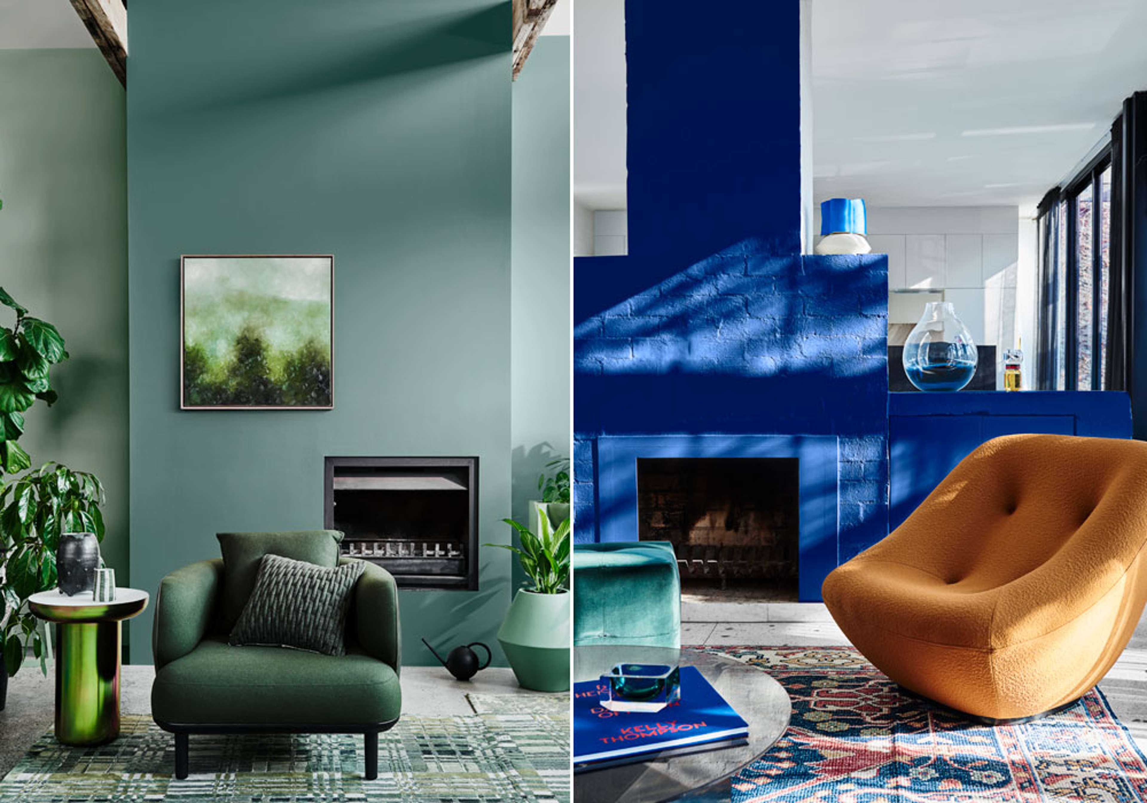
A strong signal each year as to which direct the trends are leaning is the Pantone Color Institute’s nominated Colour of the Year. After a few years of off-the-wall selections by the company responsible for the international standardised colour-matching system, its colour for 2020 is Classic Blue, a timeless tone that marks a return to more familiar shades.
But it goes deeper than just an aesthetic. For Pantone, the colour represents the “desire for a dependable and stable foundation on which to build as we cross the threshold into a new era”, claiming it instils “calm, confidence, and connection”.
Looking at it purely as a colour trend, the Classic Blue signals a desire to make a bold statement in the home, adding a reliable but contemporary ‘wow’ factor to any room.
Dulux also speaks to colour trends reflecting what is going on in the outside world.
Its 2020 theme, Essence, takes its inspiration from the “collective search for the things that bring us essential happiness”.
“With the constant demands on our time and attention these days, our homes are places we can retreat to — where we can take time to pause and reconnect with what really matters to us,” says Davina Harper, Dulux Colour Specialist.
“This is reflected in the design and colour trends that are coming through already this year, taking cues from our surroundings, with nature-inspired palettes and gentle neutrals accented by muted brights.”
A serious focus for the decade ahead is, of course, the environment, and Dulux’s ‘Cultivate’ palette reinforces a connection to nature by layering greens such as Dulux Te Aroha and Tauherenikau for a lush and relaxing effect, Davina says. Blues in all shades feature heavily in Dulux’s ‘Comeback’ palette, which takes inspiration from the sea.
“The oceanic blue of Dulux Torpedo Bay [can be] accented by clay-toned Mt Maunganui or a burgundy shade for a stronger look.“
The nature theme continues with the strong earthy tones of the ‘Indulge’ palette, while there is always a place for the natural tones and textures of Dulux’s ‘Grounded’ range too.
“’Indulge’ pays tribute to the earth itself with rich tones of terracotta and eggplant, using a coral like Dulux Ruawai to soften the look; while we see ‘Grounded’ highlighting natural materials like honeyed timber, pale leather and soft, quality linen through colours like Dulux Tapawera and Waitangi,” Davina says.
“This focus on the natural also amplifies the ‘less is more’ approach that is becoming more and more popular.”
For Resene, dark hues are coming to the fore in bedroom and living spaces, creating spaces that are appealing to hunker down and relax in, away from busy life, says Karen Warman, marketing manager.
“Use a tone on tone palette where the darkest colour leads the design and progressively lighter versions are added to complete the look. Remember to add in texture too.”
Matte finishes such as particularly help to bring out the depth and moodiness of dark hues.
Neutral colours are still popular for Resene too, Karen says, but a trend for 2020 is using more variations of a shade to avoid blandness; while its warm and earthy tones are represented by terracotta, bitter orange, muted greens, romantic pink, yellow toned browns and elegant greys.
And blues, of course, feature strongly too.
“Coastal and denim blues, especially those with more grey in them, such as Resene Coast, Resene Bunting and Resene New Denim Blue, the classic blues, are shades that will continue to be hugely popular.”

