Covid-19 has changed many things – and now seems set to change even the colours we use in our homes.
That’s the prediction from Davina Harper, Dulux Colour Specialist, outlining the paint company’s design and colour trends for 2021.
“Faced with global uncertainty, life as we know it is on hold,” she says. “We are cut off from our normal freedoms and routines, home is now the epicentre of our lives where many of us work, study, eat, sleep and relax.
“Yet at the same time we yearn to switch off so we can take a moment to ground ourselves, reflect and recharge.”
Start your property search
Harper says the global crisis has changed our relationship with our homes as the lines between work and home have blurred beyond recognition.
“This affects us on an emotional level too,” says. “We need flexible spaces that can multi-task as spaces to conduct our professional lives and perform household tasks, however, at the same time we need our homes to provide balance, calm and a sense of comfort and security.”
In response, design trends for 2021, as drawn up by the Dulux colour team, will reflect that desire for reassurance and strength, with nurturing palettes drawn from nature and furniture and décor that speaks of familiarity and comfort.
At the same time, expect to see unpredictable material and colour combinations creeping in that encourage us to adapt our homes to new ways of living and working, she says.
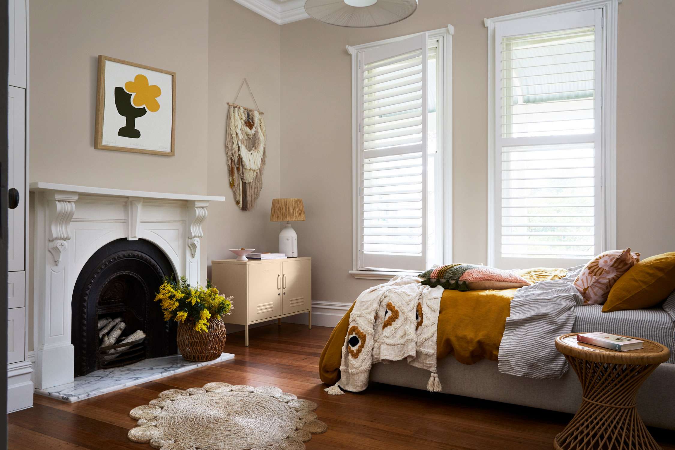
Wall colour in Dulux Sandymount, cabinet Dulux Kūaotunu and ceiling, cornices, skirting in colour Dulux Haast Half. ‘Krini’ and ‘Paved Paradise’ prints by Bibi Ana and Co., Greenhouse Interiors. Image / Supplied.
The Dulux colour team research trends consistently throughout the year, staying connected with international colour trend professionals and keeping informed on local and global lifestyle influences to predict global trends and how they will affect New Zealanders.
With most European design and architecture shows cancelled this year, the Dulux Colour Forecast for 2021 has been informed by extensive virtual research, including from Maison & Objet in Paris and Stockholm Design Week & Furniture Fair, a virtual tour on Dezeen, reports from London’s Future Laboratory, an online global trends workshop organised by the Colour Marketing Group, and numerous virtual updates and engagements with local and international brands.
So the Dulux Colour Forecast for 2021 comprises of three soothing palettes, inspired by nature along with moments of stronger colour to lighten the mood and brighten our outlook.
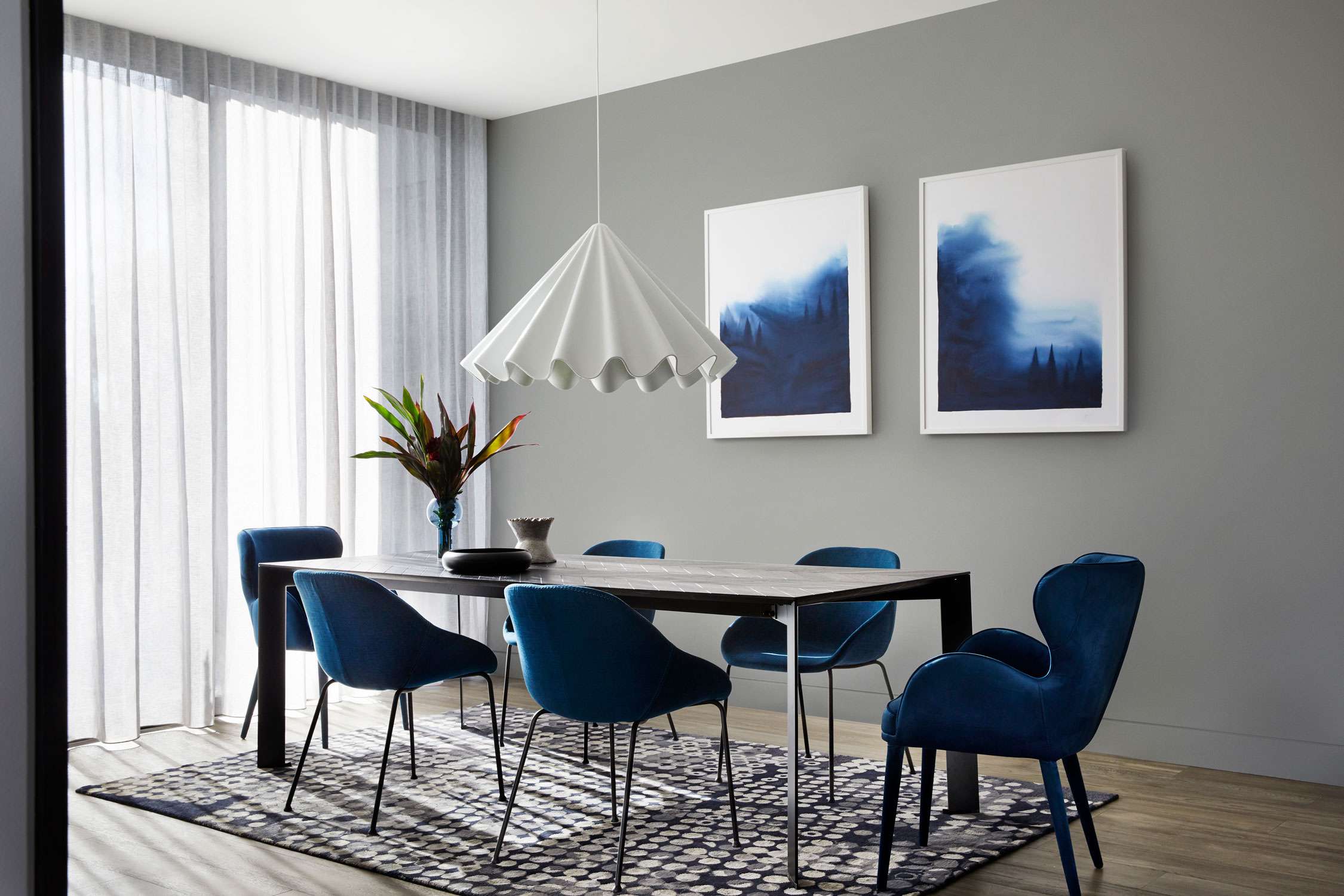
Back wall in colour Dulux Franz Josef Quarter. Artworks by Casey Freeman, Greenhouse Interiors. Image / Supplied.
The retreat palette draws on nostalgia to create that sense of familiarity and refuge we crave - incorporating up-cycled materials in raw and natural timbers, and vintage accents such as ceramics and weavings alongside modern utilitarian-shaped décor pieces to create a well-worn, yet timeless look.
RETREAT
We seek out the security of well-loved DIY traditions like cooking, baking and crafting to help us feel grounded and present.
Stormy blues channel tranquillity, signifying better times to come, whilst essential whites and burgundy feed our sense of the familiar and tradition.
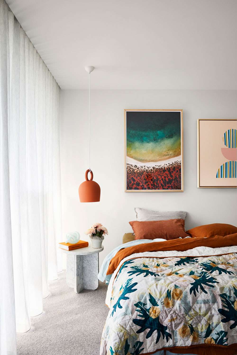
Wall Colour Dulux Cardrona, Artworks: ‘Shark Bay Series III’ by Tom Hegan and ‘Moonage Daydream’ by Anna Cole, Greenhouse Interiors. Image / Supplied.
NOURISH
While many of us are required to experience the world from within the four walls of our home, we are also facing digital saturation. Craving time and space away from our screens, there is a renewed appreciation for nature and rituals of self-care to help soothe the mind and create an aura of calm and sense of wellbeing.
The Nourish palette plays into this longing for natural beauty and earthly connection.
Hues of mossy and sage greens, turmeric and citrus connect us to nature, inspiring us to fill our homes and workspaces with plants and blooms. The tactility of materials and raw textures provide a level of physical comfort to the touch, while round-form surfaces and soft-shaped furniture offer visual relief to encourage revitalisation.
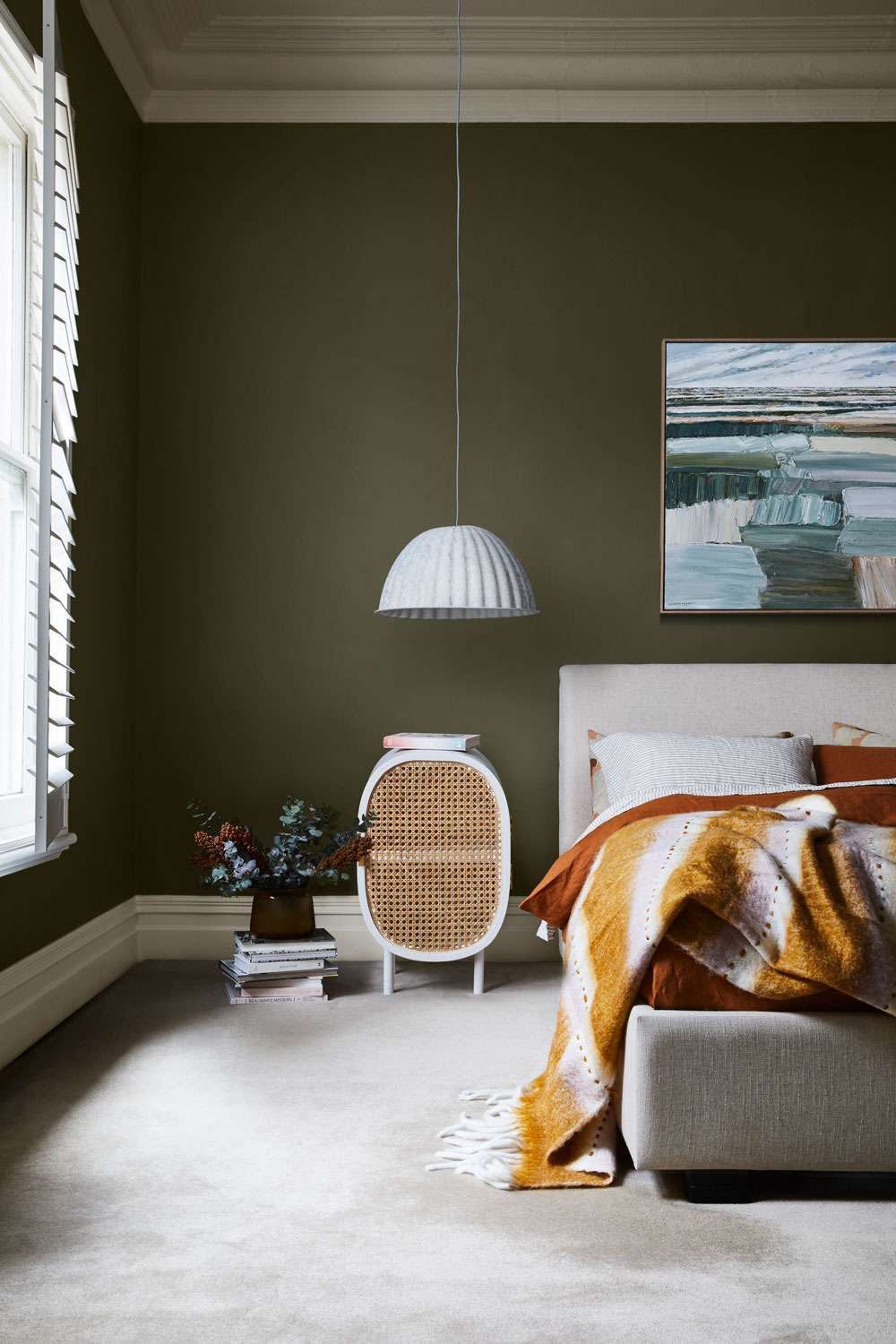
Wall colour in Dulux Olive Blend, skirtings in Dulux Marton. Artwork by Katie Wyatt, Greenhouse Interiors. Image / Supplied.
RESET
In the wake of our ‘new normal,’ a level of adaptability, positivity and resilience is on the forefront of our minds as we shift to a slow-paced lifestyle. Reflecting on what is most important to us, we draw closer to our families and local community.
The Reset palette reflects renewed energy and desire to brighten our outlook as we adapt to home life. Subtly inspired by the 70s, uplifting hues of blue-green and energetic reds offset contrasting whites and neutrals. Furniture styles and materials are mixed but unified with colour combinations for a more eclectic approach to design; whilst quilted fabrics paired with objects and mementos from past travels elevate the level of comfort and cosiness in the space. With a strong focus on family living, furniture is durable and generous in shape and form.
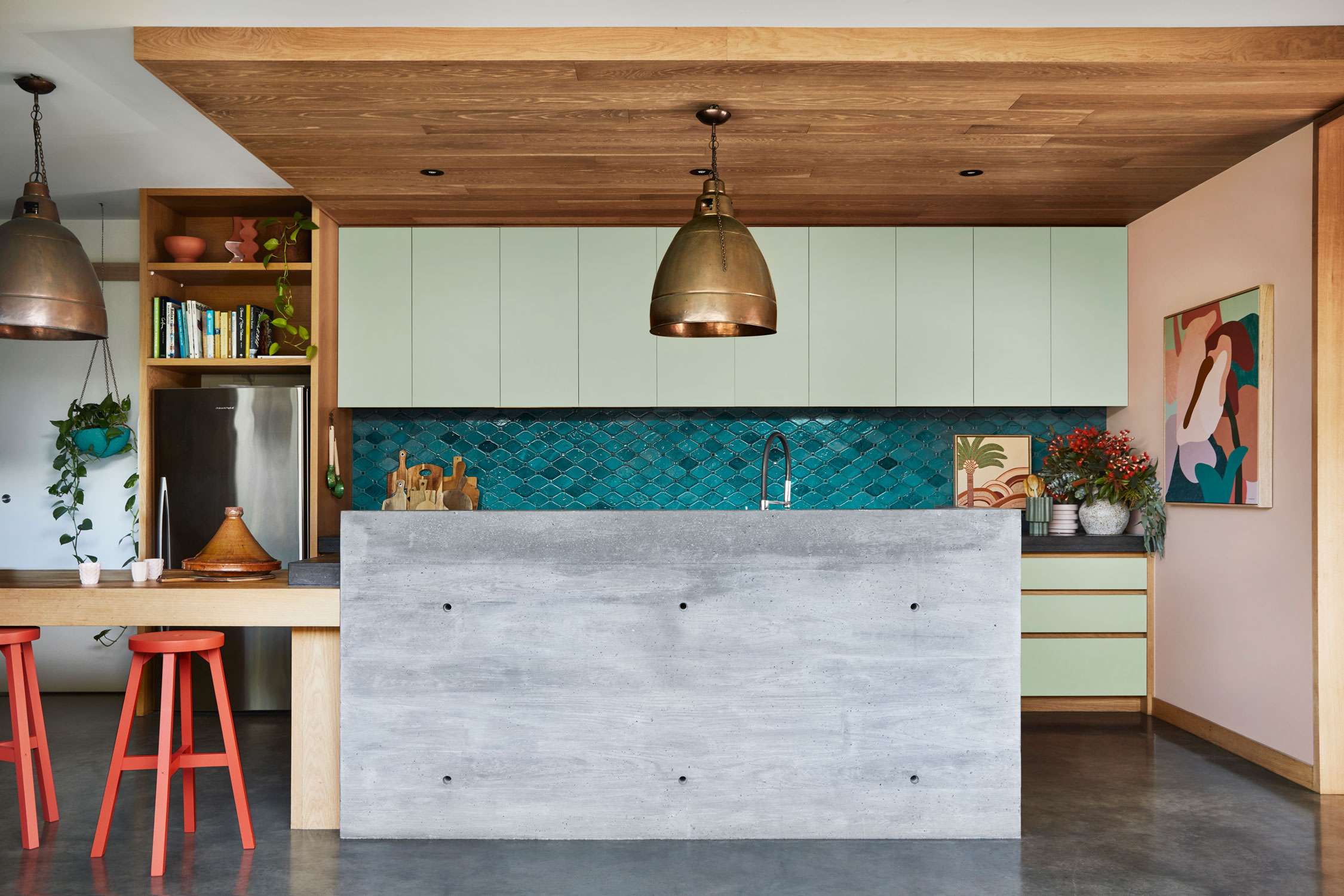
Wall colour in Dulux Prebbleton, cupboards in Dulux Woods Creek, ceiling in Dulux Cardrona. Artwork on wall -‘Anthurium II’ by Kimmy Hogan, artwork on counter by Karina Jambrak, Greenhouse Interiors. Image / Supplied.
“As we retreat indoors, fond memories of past adventures and discoveries inspire our home spaces,” Harper says. “Life may be slower, but there’s joy to be had in a less frantic pace. We draw closer to family and our local community, building new connections with those around us. There is much to be grateful for and building resilience is our latest attribute.”
Styling is eclectic and inviting; old and new sit side by side, furniture is durable and generously proportioned, and soft furnishings are tactile and forgiving – think boucle and quilting.
“Months of being stuck indoors, staring at the same four walls, creates the urge to pick up a paintbrush that’s impossible to resist,” says Harper “Taking inspiration from the 2021 palettes is a great place to start when choosing colour for your home.
“My top tip is if you’re just starting on your colour journey, start with one space and complete it – this will give you the confidence and encouragement to keep going. The bedroom is a great place to kick off your colour adventure as it’s so personal, which gives you the freedom to experiment.
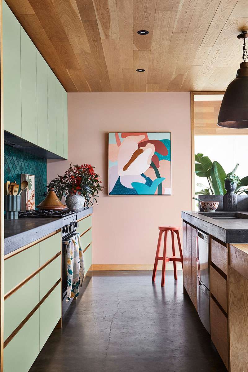
Back wall colour in Dulux Prebbleton, cupboards in Dulux Woods Creek. Artwork: ‘Anthurium II’ by Kimmy Hogan, Greenhouse interiors. Image / Supplied.
For more information on the Dulux Colour Forecast 2021 and to order free Large Colour Swatches go to: www.dulux.co.nz/colour/colour-forecast/2021
All images styled by Julia Green and photographed by Armelle Habib for Dulux.
This content has been created in partnership with Dulux.


