For novice decorators feeling nervous about their colour choices, or those who are after a timeless looking interior, classic colour combinations can be a good place to start when it comes to a room makeover.
Classic colour combinations have usually become classic because they’re versatile, working with lots of different design styles, as well as room shapes, sizes and functions - they just look good.
Classic need not mean boring and unimaginative. After all, a well-tested pairing like pink and grey doesn’t mean only one shade of pink and one shade of grey. There is plenty of room to express yourself with different shades and colour intensities, as well as your own belongings.
When you have started with a classic palette of one or two colours in your room, you’ll often find choosing other colour accents will be easier, and you’ll have more confidence because you’ll be able to see what works.
Start your property search
A classic colour palette in 90% of your space also allows you to play with on-trend colours as they come and go, adding them in furnishings and accents, that are easy and inexpensive to replace the trends change.
Quick tip: To avoid having to completely refurnish, choose your classic palette based on what works with the key pieces of furniture and the furnishings you already have. If you choose your bedroom colour first, then realise none of your linen, curtains or cushions match, it can get expensive!
Here are some classic combinations to try:
Black and white
Often referred to as a monochrome palette, there’s nothing more timeless than a black and white interior. It makes a fantastic base for any space that you can bring to life with other accents, whether it’s natural fibres, plus texture like silk or velvet, metallics or bold bright accent colours.
If you want to use a third accent colour, your options are endless really. There’s not much black and white doesn’t work with. A bright pop of turquoise like Resene Pelorous will look dramatic and modern, or warm up the finished effect with a note of burnt orange Resene Twizel or soothe the senses with more muted Resene Permanent Green.

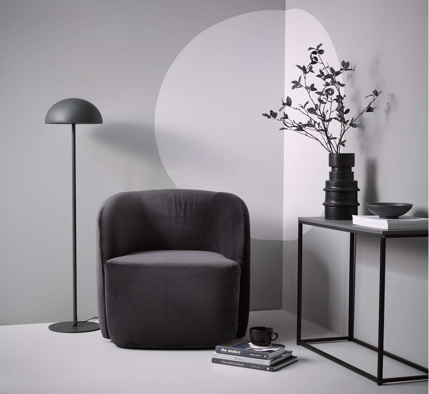
Shades of grey put a very elegant spin on a classic black and white monochrome look to create a space that would be right at home in film noir. The walls are Resene Half Stack with a circle feature in Resene Surrender. The floor is Resene Silver Chalice. The console and small bowl are Resene Half Grey Friars. The tall vase is Resene Blackjack. Project by Vanessa Nouwens. Image by Wendy Fenwick.
White on white is another version of monochrome that never goes out of style. The trick is choosing your whites carefully, playing with tones and paying attention to the light - natural and artificial. Add a little texture with bold bursts of contrast and your white interiors can go from chilly and harsh, to warm and filled with personality.
If bold black and white seems too stark, put a more muted spin on the combination with deep charcoal Resene Element and a milky white like Resene Half Merino.
Primary colours: red, blue and yellow
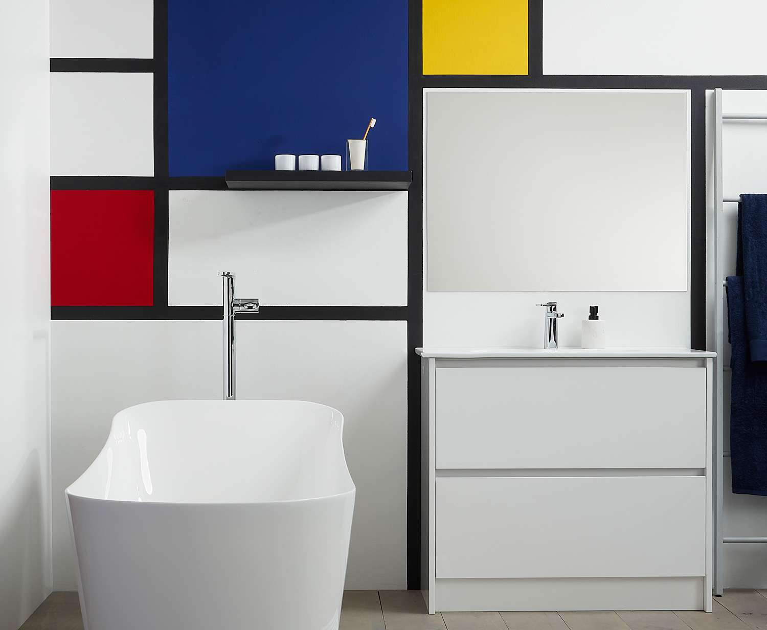
Primary colours are the colours of pop art which makes them fun to play with in creative spaces like kid’s bedrooms and studios or offices. They also pop well against bright whites so it can be fun to experiment with them in kitchens and bathrooms against glossy white tiles and appliances. Add some black trim and you have your own in-house Mondrian inspired design.
For a softer effect go for muted versions of the classic primaries. Say, Resene Pohutukawa red with mustard-toned Resene Putty yellow and a moody grey-hued blue like Resene Bali Hai.

This crisp bathroom with its Mondrian style shapes and colours contrasting with a monochrome background is a modern masterpiece. The wall is Resene Eighth Black White with a grid in Resene Blackjack and colour blocks in Resene Jalapeno (red), Resene Aviator (blue) and Resene Galliano (yellow). The timber floorboards are Resene Colorwood Mid Greywash. The shelf is Resene Blackjack and the towel ladder is Resene Quarter Surrender. Project by Megan Harrison-Turner. Image by Bryce Carleton.
Red, white and blue
It might seem a bit too cheesy at first thought, but red, white and blue can make for a really vibrant, fresh colour scheme. To avoid a brash ‘fourth of July’ vibe, play with the intensity of colours and opt for warm toned reds and blues, and creamy whites like Resene Merino. Play with textures as well - add in natural wood features, and soft furnishings to keep the look soft and relaxed. You could even go for stained wood finishes in Resene Colorwood Apollo Blue or Resene Colorwood Red Pepper to keep those classic colours without them overwhelming the room.
A classic sea blue like Resene Bondi Blue, with a crisp white like Resene Alabaster can be the basis for a classic Hamptons style, beachy look. Pair with plenty of natural wood and add a 10% finishing touch of a deeper red such as Resene Red Oxide to bring it all together.
If you want to apply the same principles of a red, white and blue combination with a modern twist, how about navy Resene Prussian Blue with the soft neutral tones of Resene Sea Fog and a burst of orange-hued Resene Rich Gold.
Green and neutrals
The colours of nature are always a popular classic, whether you’re looking for relaxed bachy style or refined elegance. Follow the trend for muted, zen-like shades by mixing soft greens like Resene Coriander or Resene Thistle with pale greige Resene Titania.
For a fresh, bright look, pair Spring greens like Resene Norway or Resene Spring Green with whites or pale creams and use wooden accents as your third colour, with plenty of natural textures like rattan or hessian.Natural combinations can still be glamorous though, just go bolder and deeper with your colour choices. Try Resene Celtic walls with highlights in Resene Pavlova and trim in Resene Bianca, for a dramatic, stylish space. Add touches of gold to really bring the glamour. If you have an ornament that doesn’t suit your new palette, paint it using Resene Gold metallic paint to bring it into the new look.
Quick tip: If you’re focusing on a mix of two colours, don’t be tempted to try and use them in equal amounts; they’ll end up competing. Instead choose one as your main colour and use the other as secondary highlights. The simplest combo to work with is often three colours - using your main colour in 60% of the space, a second colour in 30% with an accent colour in 10%.

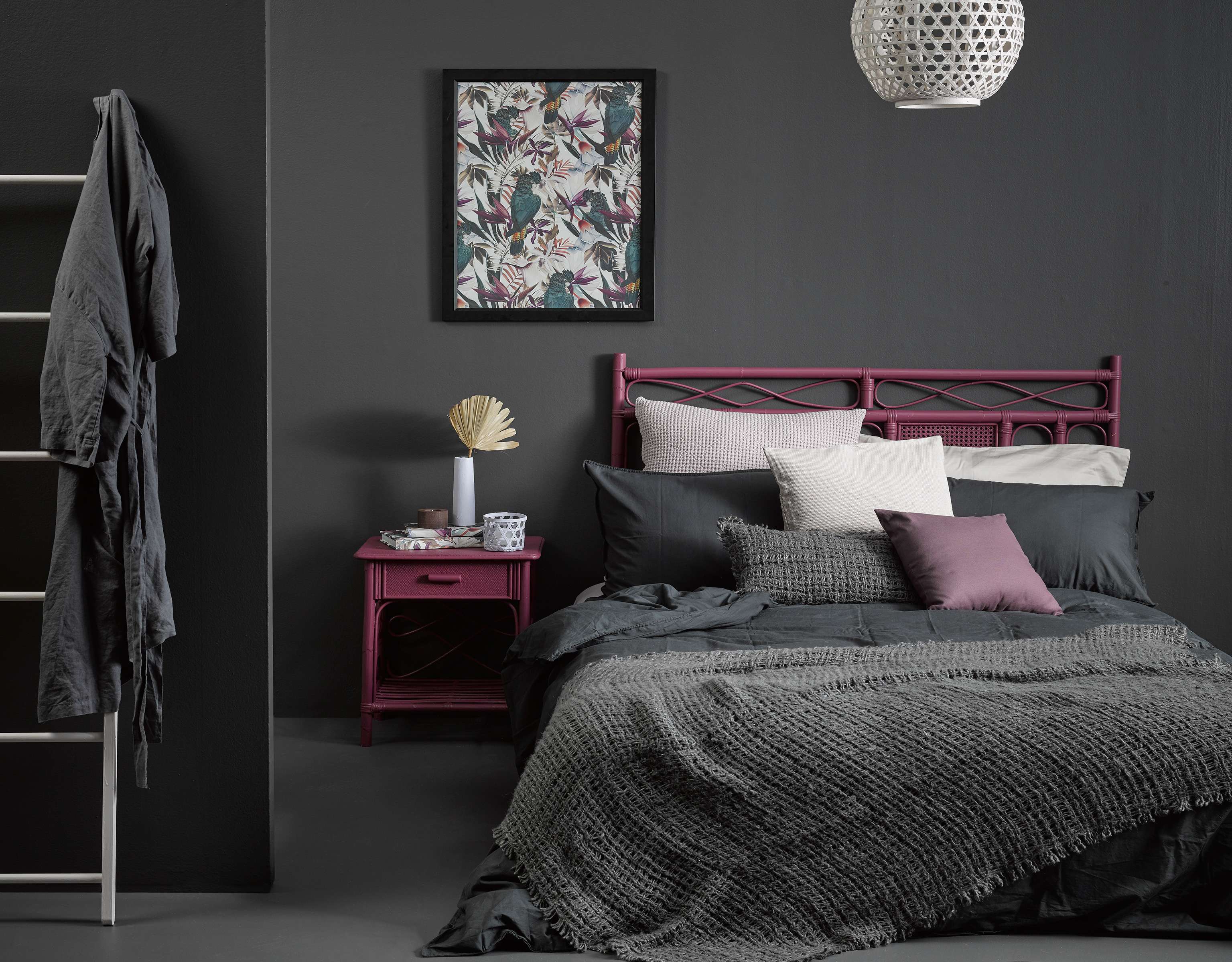
Magenta accents and charcoal make for a dramatic, moody spin on classic pink and grey. The walls of this bedroom are Resene Quarter Bokara Grey, the floor is in Resene Eighth Bokara Grey, the cane headboard and side table are in Resene Virtuoso, the pendant light and ladder are in Resene Ethereal, the slender vase, tea light and hex wall planter are all in Resene Dreamtime and the cork tealight holder is in Resene Rebel. Project by Vanessa Nouwens. Image by Melanie Jenkins.
Other classics to try:
Green and yellow - to keep it going too sporty opt for khaki tones such as Resene Flax with pale golds such as Resene Butter.
Pink and green - this delightful combination has so many possibilities, from muted botanical tones to fresh spring colours or fun candy colours. For soft modern pastels try Resene Soothe and Resene Spanish Green or go loud with Resene Cranberry and Resene Limeade.
Pink and grey - Modernise this 80s favourite by moving from cutesy baby shades to moodier muted shades. Try coral pink Resene Shilo with deep, blue-tinted Resene Charade.
Quick tip: When you’re not sure where to start, the Resene Classic Collection colour chart gathers together some of Resene’s most popular and timeless colours along with customer favourite whites and neutrals.
Order your Resene Classics Collection colour chart online, resene.co.nz/ordercharts, or visit your local Resene ColorShop to pick up a copy.


