Originally published in Homestyle magazine.
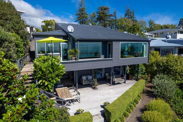
Amid an outlook of dappled green with a soundtrack of chirping cicadas and the thwack of tennis balls coming from the club behind the hedge, it’s easy to forget you’re fairly close to the central city when you’re standing on the deck of this home in Remuera, Tāmaki Makaurau/Auckland.
When asked whether he considers himself a mid-century enthusiast, its owner and architect Julian Guthrie says, “Absolutely, yes! I really love the early modernism. There were exciting, experimental things happening internationally and here in New Zealand, resulting in some lovely little places. Typically, they were simply built and modest in scale, but a lot of the language of the architecture of that time still feels fresh and interesting.”
During the hunt for a place to call home with his wife Georgie and their blended family, Julian was thrilled with the discovery of this vintage gem, designed by late Christchurch architect Don Cowey and tucked away in a suburban valley. It was close to its original condition, but a coat of paint and the removal of the mouldy carpet made it more liveable while Julian took the opportunity as ‘live-in architect’ to work out the best approach for a sympathetic update.
Start your property search
He says moving in with his then new fiancée and four children between them was “a bit of a social experiment”, so they figured a pool would be an ideal tool to help the kids bond. This became the catalyst for tackling the basement level of the home in the first part of a two-stage project.
One of many things about this property that appealed to Julian and Georgie was its large, level lawn and leafy views. “It’s got a slight feel of [West Auckland’s] Titirangi in the centre of town, so it’s quite a special site,” says Julian. “We loved the true modernist details of the house and aimed to keep and enhance them while retaining as much of the garden as possible.”
Extending the basement out to the line of the pavilion above maximised the home’s floor area, eliminating the need to extend the overall footprint. “In a fairly complicated construction sequence, we propped up the house on steel beams and had a bulldozer drive around underneath it, digging out the space directly under our feet for six weeks, while the dust drifted up between the floorboards,” says Julian. “We got through it, though!”
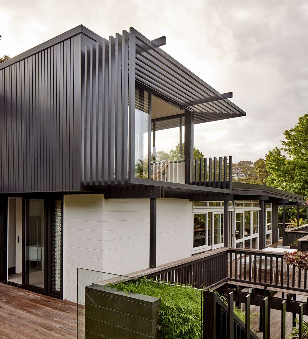
This renovation project broke through the flat-roofed rectangle of the existing dwelling with something different yet wholly complementary, featuring Metro Series joinery from First Windows & Doors in Matt Flax Pod.
Laying this groundwork resulted in a teenage-friendly downstairs zone with bedrooms, a bathroom, a living space and easy access to the new pool and shored up the house structurally ahead of stage two of the renovation — going up.
In this phase, the original pavilion was reorganised to make way for a new entrance and stairwell linking the lower level at the western end of the house, and to accommodate two more kids’ rooms and a bathroom in the eastern wing — all while preserving the central living space, where a lounge, dining area and galley kitchen circulate around the original brick fireplace and connect to decks on all sides that have been reworked to cantilever out over the pool.
“I looked at a number of schemes for fitting in one more bedroom pavilion but kept coming back to the feeling of wanting to preserve the land around the house,” says Julian. “In the end, we put the main bedroom on the top at the far, eastern end of the house, giving it a sense of being its own lofty retreat where we can escape it all.”
For this new rooftop hideaway, Julian made the decision to design a single form clad in one material, aluminium — paired with Metro Series aluminium joinery from First Windows & Doors — to make it distinct from the brick, concrete block and timber of the old house.
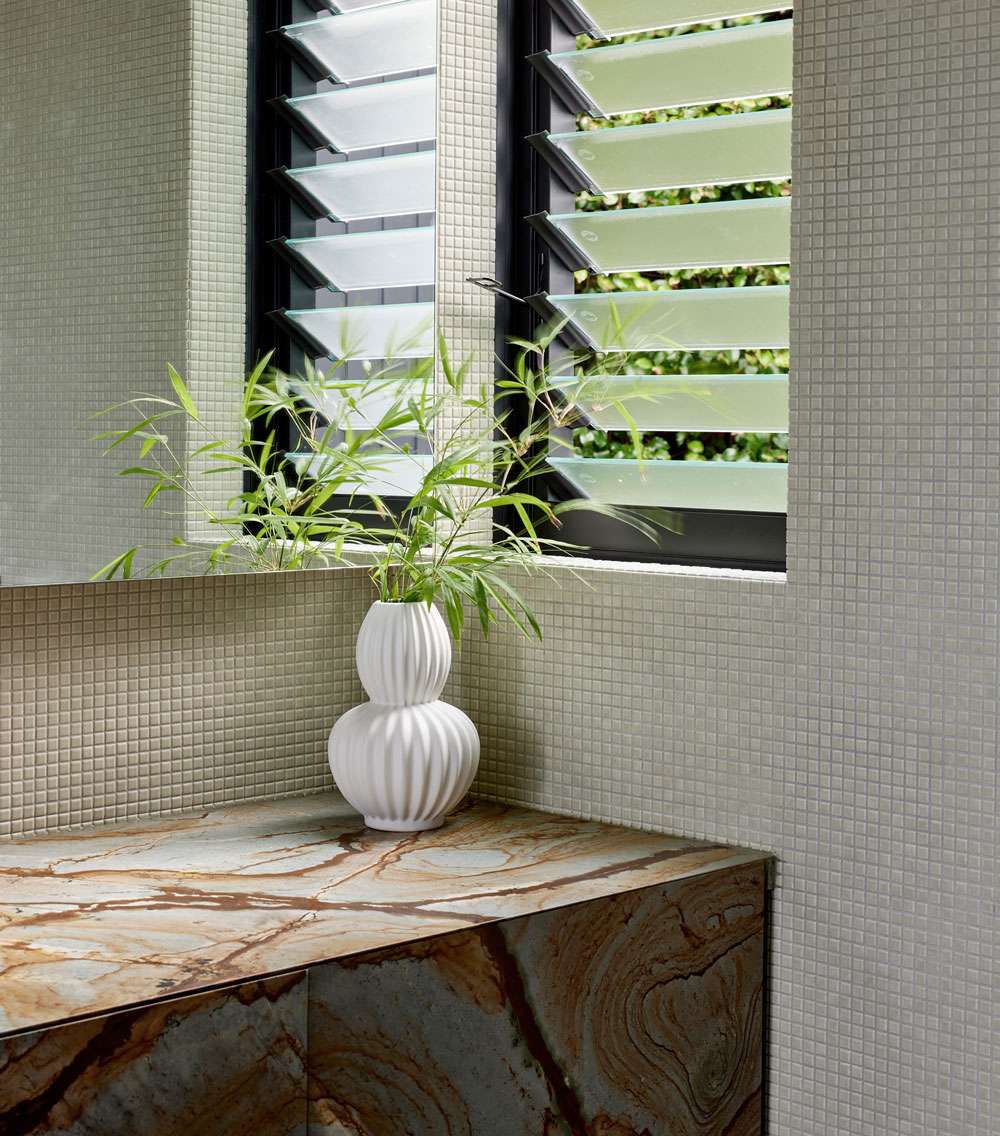
Louvre windows also make an appearance on both sides of the ensuite, providing cross-ventilation.
On this level, the elevated outlook over the treetops is enhanced by north-facing stacker sliding doors that frame the view. Windows wrap around to the western side, where they capture the last light of the day.
“Rather than having a bedroom balcony, which most people say you never actually use, we opted for floor-to-ceiling doors, then set a half-height piece of frameless glass into the Metro Series joinery, so that it reads as fully open, but the glass stops you toppling out,” says Julian. “The feeling of opening the sliding doors is dramatic and beautiful, and it lets in lots of fresh air.”
In the ensuite, some good luck with regards to the positioning of the neighbours’ place gave the couple the opportunity to make the windows here similar to those in their bedroom. “The joinery has been beautifully arranged, so when you’re lying in the bath, you can slide open the door, look out to the trees and listen to the native birds that flock around here,” says Julian. “It’s really quite special.”
Again, speaking the mid-century language, Julian’s eye for detail is evident in the repetition of forms that communicate between vintage and modern in an appealing way. Wherever new elements feature, there’s always a reference back to the original building or the era.
“I was conscious of refreshing the house as a celebration of its 50th anniversary,” says Julian. “I hope that through us staying true to its mid-century spirit, in another 50 years, people will still be able to say, ‘Gee, that feels great’.”
See more of this home at firstwindows.co.nz/love-language


