Balancing your interior design between what’s on-trend at the moment and what’s going to suit your interior and your personal taste can be tricky.
Just like trying to keep up with the latest clothing fashions, being super trendy can be expensive, exhausting and not everything is going to suit you!
Here are some simple tips for using interior design trends as inspiration rather than a strict instruction manual when you’re decorating your home.
Style and error
Start your property search
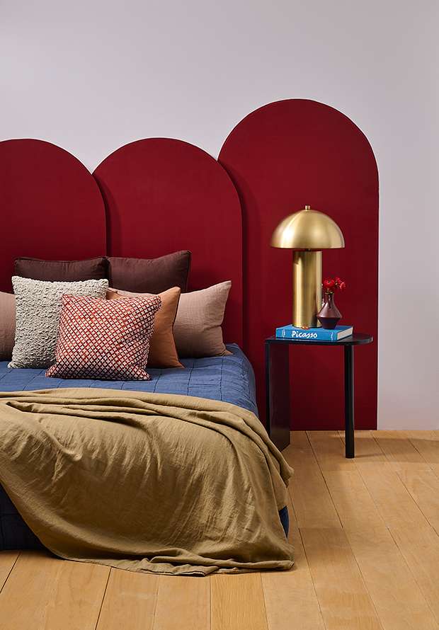
This on-trendburgundy headboard in Resene Salsa adds classic glamour to this bedroom, and iseasy to repaint if you tire of the colour. The back wall is painted in ReseneBonjour and the timber flooring is stained in Resene Colorwood Natural. Thebedside table is Resene Jaguar. Lamp fromFreedom, quilt from H&M Home, rug from The Ivy House. Project by Kate Alexander, image by Bryce Carleton.
Embrace slow style and take your time to put together interior looks that suit you and your lifestyle. Keep a design scrapbook, diary or mood board, where you collect snippets of different design trends and filter the ones that resonate most with you.
Move things around, see what works best together and start to pick out classic colours, styles or design features inspired by current trends. Most trends stem from a fresh spin being put on something classic like a particular shade, colour combination or style like minimalism or mid-century modern.
Pick the elements you like from different trend sources and start to think about how you can tweak them to make them your own.
The opposite of this approach can also be true. Sometimes a colour might be deemed trendy like, for example, the mauve-toned periwinkle blue of Resene Portage, and while you know trends will change, you love the colour and love the idea of it being on your bathroom walls for the foreseeable future.
The trick is always to think long-term, and ask yourself how you think you’ll feel about your design choices a few years down the track.
Top tip: Make good use of samples whether it’s Resene testpots, upholstery and curtain samples, or test tiles and flooring samples. Try different things together and keep a note of what you like.
Start with neutrals
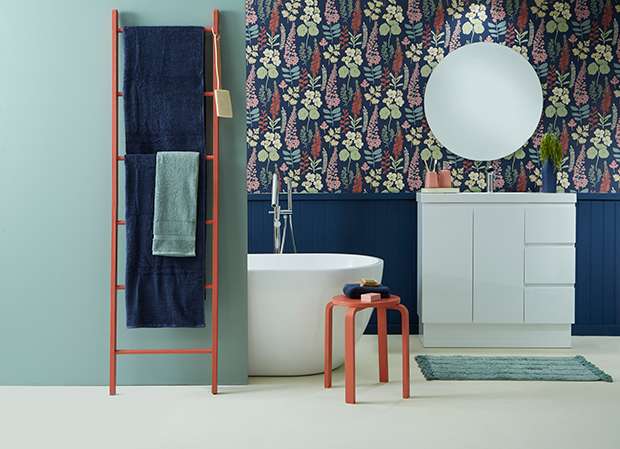
This bathroom features on-trend bold floralwallpaper Resene Wallpaper Collection E384534 with pops of popular coral in Resene Apple Blossom on the ladder andstool. All of these are easy to update in the future while keeping the classicdeep blue Resene Bunting and neutral Resene Coconut Cream flooring. Stool (painted in Resene Apple Blossom) from Mocka, towels, mat, loofah, ladder(painted in Resene Apple Blossom), dispenser and tumbler (painted in ReseneCoral Tree) from Kmart. Project by Vanessa Nouwens, image by Bryce Carleton.
Neutrals offer a safer, simple and less expensive way to play with trends and adapt them to your taste.
Keeping the backdrop to your space on the walls, flooring, ceilings and trim, to a neutral palette, leaves you with a blank but tasteful canvas to which you can add fittings and decorations that reflect more transient trends.
It’s worth noting that variations of neutral shades such as Resene Black White, Resene Alabaster and Resene Sea Fog make up a large part of Resene’s top 20 most popular shades, which means they’re always trendy and timeless.
To choose a neutral, experiment with some Resene testpots to work out whether cool or warm tones are going to work best in your space, and how they might match with the on-trend colours you like.
This means your main paint investment is in classic colours that won’t date, but you can add impact colours on shelves, pots, picture frames, side tables or even a feature wall for very little expense, which can bring your room right up to date with trends.
If you’re worried a neutral background will be too boring, it’s also worth mentioning that, creating a blank canvas for your room that allows for trendy switch-outs doesn’t mean white on white. There is a large range of neutral shades that offer a touch of background colour to your space, but which are flexible enough to still work with a wide range of seasonal accent shades. Some non-white neutrals to try are smoked greys like Resene Silver Chalice or greiges like Resene Truffle.
The other cost-effective way to add some trendy touches to your neutral space is by using Resene Wallpaper. Pick a trendy design you love and add it to one feature wall of your room, or simply add touches of it perhaps as a faux bedhead or on drawer fronts or the back of shelves.
Fun designs that are on-trend at the moment are ornate botanical designs like Resene Wallpaper Collection 99346, bold geometrics like Resene Wallpaper Collection 91141 or the sophisticated Resene Kimono Collection 409345.
Working with colour trends
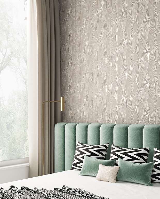
Arches are a big interior trend, as arewarm neutrals and Resene Wallpaper Collection AGA101 combinesboth trends. Pair with walls in green-based white Resene Merino or Resene RiceCake and finish the room with sage or olive green furnishings. Project by Vanessa Nouwens, image by Bryce Carleton.
Paint is a very effective tool when it comes to adding trendy notes to a classic style, or just figuring out what colours really suit your design style. It is relatively inexpensive, you can get Resene testpots to try before you buy and it’s easy to change if you decide on a new look in the future.
Before you choose your colour don’t just pay attention to how you want the room to look, think about how you want it to feel - or more to the point, how you want it to make you feel.
Let’s look at some on-trend colours and how you might adapt them to suit different spaces and design themes.
Deep greens - Resene Jurassic or Resene Forest Green. Take it classic with creamy trim in Resene Half Spanish White and notes of Resene FX Metallic Gold. Alternatively, use the deep greens as a bold highlight in a few small areas against a neutral backdrop of Resene Thorndon Cream. For a fresher more romantic feel, go slightly lighter with Resene Parsley with a bright white Resene Alabaster and a touch of soft pink Resene Pale Rose.
Sky blues - Resene Ziggurat or Resene Solitude. These on-trend moody pastel blues work well as a backdrop to bold shots of charcoal Resene Triple Dune or dark chartreuse Resene Karma. Alternatively, you can flip the palette and use your sky blues as subtle accent colours against a white backdrop in Resene Poured Milk. Add a piece of art or furniture in deep red Resene Merlot for a timeless look.
Wine reds - Resene Salsa or Resene Persian Red. Bold reds can be off-putting for some decorators, worried they will overpower everything else or make a room feel claustrophobic. But for a stylish, and sophisticated finish, shades like Resene Shiraz work well in small amounts against a classic black and white room. They’re also excellent if you want a glamorous, vintage finish, by pairing with gold accessories and black trims.
For more on the latest trends, see the latest habitat plus – decorating and colour trends book (hyperlink to https://www.resene.co.nz/homeown/Habitat-plus/Habitat-plus-14.htm) and visit your Resene ColorShop for everything you need to create your chosen look at your place.