Step outside your comfort zone with bold, rich colours. It may be just the thing your space needs.
The secret to using colour courageously lies in choosing what you really love. That idea may seem obvious - not many people, after all, would likely spend their money decorating with colours that don’t strike a chord. With bold, jewel tones trending across a number of areas of design right now, it shouldn’t be hard to find one that you’re personally drawn to. Whether it be emerald green, midnight blue or a violet fit for royalty, the key to making it work is to pay attention to how it makes you feel and then decide whether your space will need a little or a lot to make the statement you’re trying to achieve.
Function first
Consider what functions you’re going to be using the room for: is it a cosy retreat, a lounge for entertaining or somewhere practical for getting work done?
Start your property search
Decades worth of studies have shown that the colour you choose in a space impacts your mood when you’re in it, so you’ll want to select one that brings the right vibe for the activity at hand. A strong colour scheme that showcases deeper, more saturated colours can elicit a strong emotional response. Certain bold shades create feelings of security and comfort while others may feel too heavy or even closed in.
Before you fully commit to a bold colour, you can get a feel for it by painting a large swatch onto cardboard with a Resene testpot, leaving an unpainted border around the edge. Move it from wall to wall and see how it looks in different lighting. Pay attention to how it makes you feel before coming to a decision. It’s no use having a space that you’ll never go in because the wall colour is so electric that it instantly brings on a headache.
Start small and simple
If you’re new to using striking shades, it’s best to stick to just one and keep adding less-vibrant layers until you reach just the right intensity.
For example, if you go for a deep charcoal blue like Resene Coast on the walls, try a softer, warmer grey or blue for major fabric elements like the couch, bed linen, cushions or curtains. Slowly add accessories in lighter, complementary shades such as Resene Safehaven, Resene Lazy River or Resene Triple Duck Egg Blue and finish off with a pale neutral like Resene Sea Fog for a vase or window frame.
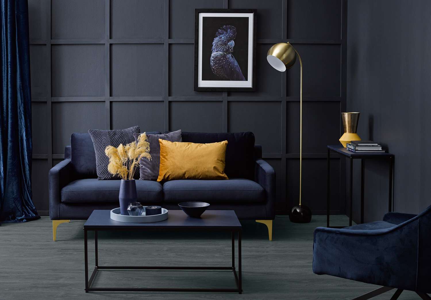
Hot spots of gold and rich mustard bring this luxurious living room to life. The deep Resene Twilight Zone walls are given extra visual interest with simple wooden battens. The floor achieves extra depth with Resene Colorwood Mid Greywash over a coat of Resene Colorwood Crowshead while still allowing the wood grain to show through. Layers of deep blue accessories, like the Resene Indian Ink coffee table and sideboard tops, the Resene Excalibur tray and the Resene King Tide vase, tealight holder and bowl add oceans of irresistible style. Project by Vanessa Nouwens, image by Melanie Jenkins.
Another good idea is to opt for something like a picture frame or a pendant light in a complementary colour darker than your walls. This will help the walls recede a little to create more visual space.
If you have wooden floors, think about staining them with a light neutral like Resene Colorwood Greywash to give the rest of your scheme room to breathe, or pick a carpet several shades lighter than your walls will be.
Tap into texture
Mixing a variety of textures in a room is another easy way to stop a bold colour from overpowering the space. For instance, installing wood panelling, moulding, cornices or textured wallpaper can create more visual interest and break things up to keep a solid bold colour from completely taking over.
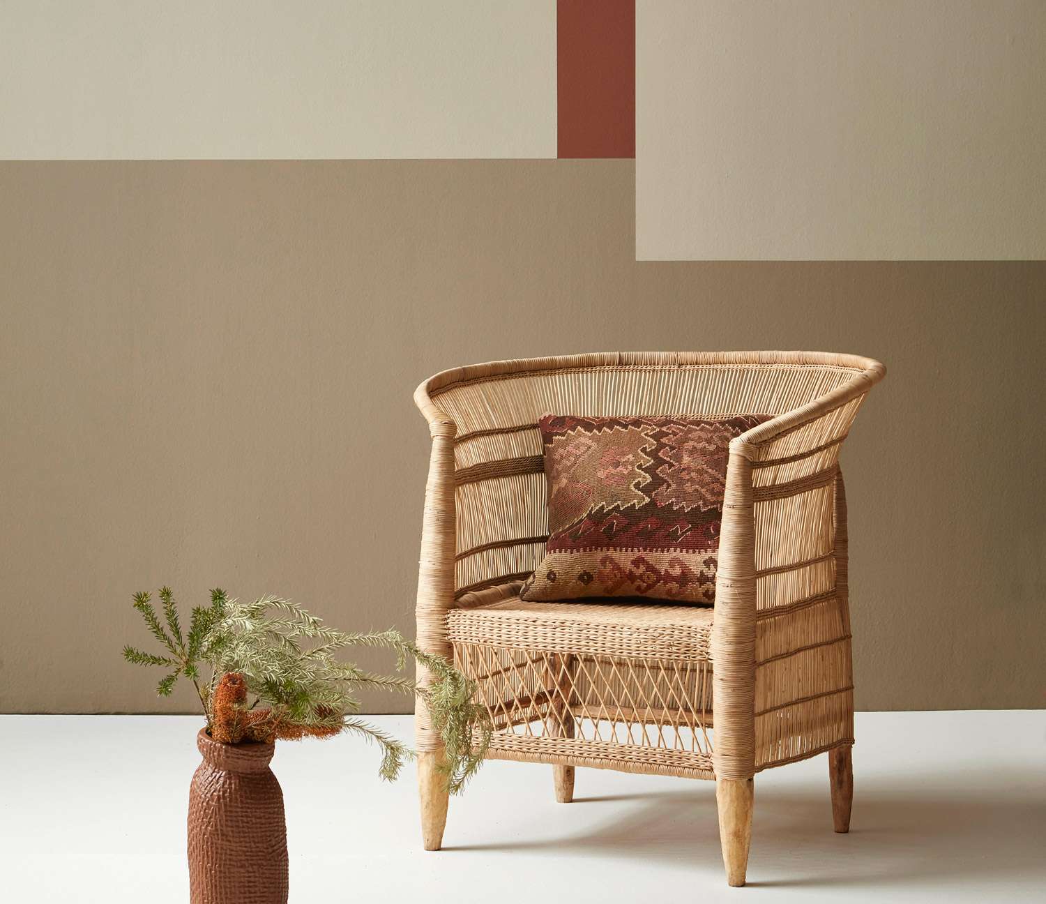
Accessorising with natural fibres such as rattan, rope or simple cotton mats is another great way to add levity to an intense colour choice. Leave them in their natural state or paint or stain them a similar shade to your main room colour if you want to keep things monochrome. Lush fabrics like velvet, silk or leather bump up the luxury factor and build a sense of retreat and relaxation in your room.
A strip of Resene Route 66 creates a focal point in this space, while the wall in Resene Grey Olive (top left), Resene Earthen (bottom) and Resene Napa (upper right) build a dramatic patchwork behind it. This easy-to-recreate idea makes use of a neutral and natural palette while still being striking and adding dimension to what could have been an otherwise boring space. Project by Gem Adams, image by Wendy Fenwick.
Whether it’s flowers in a shade that matches your palette or lush leafy greens, plants help bring the outdoors in and add more texture. Dark tropical leaves work well with greys, reds and burnt oranges, while leaves in paler or brighter greens can add some freshness to deep blues and purples.
Commit to contrast
Going bold doesn’t have to be isolated to just one colour. Accents of another bold contrasting colour can lend real drama and interest to a room. If you’re stuck for what will work well, consider some classic colour combinations. Pink and charcoal, such as Resene Shilo and Resene Quarter Bokara Grey, red and green, such as Resene Dynamite and Resene Family Tree, navy and orange, such as Resene Bewitched and Resene Twisted Sister or, of course, black and white, such as Resene Nero and Resene Alabaster. The variations within these colour combinations is massive, and with some experimentation, you may even end up with a room that’s both classic and completely on trend.
The trick is to choose one colour as your main selection, then add pops of a second bold colour through your furnishings, accessories and art. Add a few subtle shades or a neutral for balance.
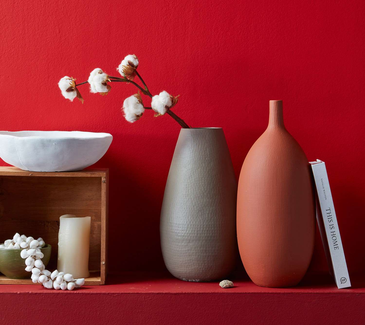
The box is stained Resene Colorwood Natural, the bowl is Resene Elderflower and the vases are in Resene Double Pravda and Resene Moccasin. Project by Gem Adams, image by Wendy Fenwick.
Bold and neutral
If too much intense colour is not your thing, you can still go bold by starting with a basic neutral or natural colour palette. Try a dark coffee shade like Resene Sambuca paired with the fresh, grey-green neutral of popular Resene Half Tea and a floor stained in Resene Colorwood Iroko. Resene Thunder Road is a warm, moody brown that pairs well with mid-range greens like Resene Mother Nature when it’s offset by a creamy neutral like Resene Half Spanish White. For an even more subtle look, opt for a soft smoky green backdrop like Resene Napa and paint trims or a feature wall in a deeper earth tone, such as Resene Earthen and Resene Sambuca. Finish with a floor in Resene Colorwood Whitewash and plenty of natural fibres.
No space too small
If you’ve ever heard the ‘rule’ that you shouldn’t use dark colours in small rooms, let this be your permission to dismiss it. Depending on what you use the room for and how it’s lit, not all dark colours automatically make a small room feel claustrophobic. Ask your Resene colour expert to show you some shades that have a cool base, which can help make walls recede and build a dramatic background to showcase your furnishings rather than dominating the space.
If you’re nervous about covering an entire room in a dark shade, think about trying it in what is likely your smallest room of all - the bathroom. It’s a space that’s prime for experimenting, as it’s generally not a centrepiece of your home, and if your tastes change, it’s a small area that takes less effort to repaint.
Textures make all the difference when opting for multiple layers of the same rich colour. This painted pressed tin wall pattern draws in the eye while the subtle greens in the flower arrangement elevate this Resene Virtuoso setting.
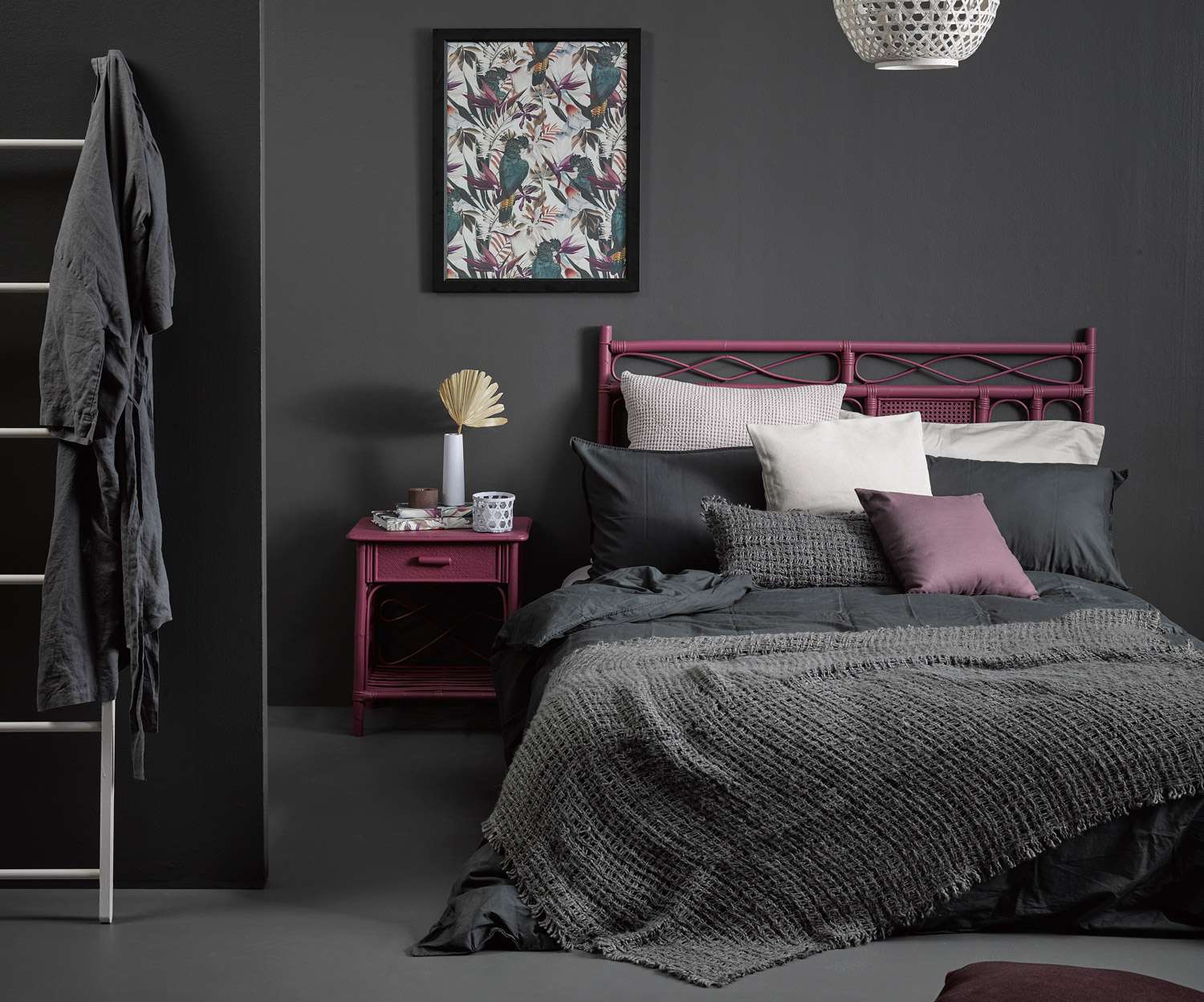
Moody Resene Quarter Bokara Grey walls and floor in this dark bedroom are made even more enticing with the touches of deep purple Resene Virtuoso on the side table and headboard, which echo the palette in the artwork. The subtle shades of the textured bedlinen pile on softness and build balance, as do the ladder andlight in Resene Ethereal and the vase in the aptly named Resene Dreamtime. Project by Vanessa Nouwens, image by Melanie Jenkins.
Tips and tricks
Try to keep intricate patterns to a minimum so the bold colours are the ones doing the talking, or the room could get a bit noisy.
Most dark shades work well with bold jewel tones that match their undertones like buttery golds, emerald greens and deep pinks. Colours and fabrics, particularly on trend velvet, will add an inviting sense of comfort and luxury.
If you’re worried about a room being too dark, try large mirrors to reflect more light and optically expand the space.
If you’re starting with a bold feature wall rather than an entire room, it will likely be the first place the eye gets drawn to. If you have another bold architectural feature in the room, it may end up competing for attention and make the room feel divided or too busy. Look for strong colours that complement rather than compete with other features.
Spirited shades
Two different shades of outrageous red might sound like a lot, but here Resene Poppy on the upper part of the wall and Resene Dynamite beneath it work together to break up a dynamic feature wall without diminishing its impact. The richness is emphasised with a boldly contrasting stencilled floor painted in a base colour of Resene Wishing Well overlaid with a pattern in Resene Time After Time.
For more colour ideas and inspiration, visit your local Resene ColorShop or view the latest looks online at resene.co.nz/latestlooks.