Movie director Wes Anderson is famous for the distinct look he lends to each of his films. It’s whimsical, sophisticated style with vintage influences that makes smart and creative use of colour.
The clever balancing act of influences and considered colour choices makes the “Wes Anderson look” a rich source of inspiration for interior designs, particularly if you’re wanting to embrace “quirky chic” and create looks that are fun, offbeat and uniquely you.
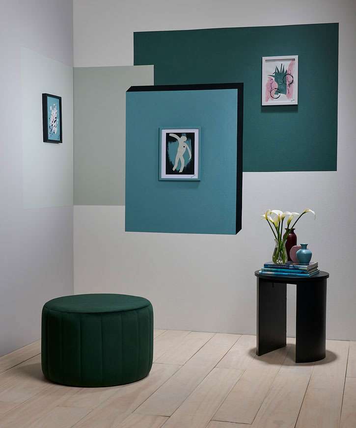
This cleverly colour-blocked gallery wall turns a simple space into something unique and interesting. It’s an easy idea to make a feature of otherwise unused areas or an entranceway. The rear wall is painted in Resene Half Black White, side wall in Resene Triple Concrete, floor in Resene Colorwood Breathe Easy, colour blocks in, from left, Resene Tasman, Resene Gothic with Resene Double Cod Grey shadow and Resene Green Meets Blue, table in Resene Double Cod Grey with vases in, from left, Resene Spitfire, Resene Vintage and Resene Gothic and DIY artwork and frames in Resene Double Cod Grey, Resene Spitfire, Resene Triple Concrete, Resene Gothic, Resene Vintage, Resene Half Black White and Resene Green Meets Blue. Ottoman from Danske Møbler, vase and flowers from Interflora. Project by Moneuan Ryan, image by Bryce Carleton.
Start your property search
There’s no strict colour palette for a quirkycore or Wes Anderson-influenced interior. Some looks can be all layered pastels in greens, blues, yellow and pinks like Resene Peppermint, Resene Jet Stream, Resene Quarter Moonbeam, and Resene Cosmos, others can make bold use of colour-blocked brights in primary shades like Resene Red Red Red, Resene Turbo and Resene Resolution Blue.
An individualistic look is really about how you use the colours as much as what colours you use. The colour schemes can often appear simple and straightforward, but as you add layers of pattern, shading and texture you add levels of interest and complexity that can surprise and delight. The key to a successfully quirky and whimsical look is to be intentional about the elements of your design.
Resene Colour Expert Rebecca Long describes the fundamental aspects of a Wes Anderson-style quirky interior as unconventional and incorporating eccentric elements such as unexpected patterns, colours and accessories.
Watch Here:
“Wes Anderson understands colour theory and deliberately uses highly saturated colours to express emotions and set the theme for his characters and sets,” she says.
“While highly effective, his approach is generally quite subtle. A simple, richly-coloured red beanie in an otherwise muted environment has the power to evoke a strong sense of anger or passion in the scene. Blue on the other hand can communicate calmness and intelligence.”
Rebecca says the key to using a mix of colours and patterns to create a unique look that doesn’t look too busy or cluttered is to work with symmetry, alignment and repetition.
“By abiding by basic design principles, you can continue to add colour, pattern and individuality to your home. Rather than committing to a full-sized feature wall, simply introduce Resene Rouge to the lower half of your bedhead wall. Build on the quirky chic look by introducing a floral pattern to your bedside tables and layer up an assortment of cushions on your bedding. Play with a range of shapes and sizes for maximum impact.”
This layering of pieces lets you add the individuality that makes a quirkier look work, Rebecca says, and lets you build up the style over time. To get started and play with how colours and shapes work together, she suggests starting with something small like a picture frame.
“Add maximum impact to a simple picture frame by painting it a colour or pattern that either complements or contrasts against the photograph or artwork it frames. A photograph of spring blossoms can be further enhanced by an intriguing, Resene Irresistible frame or contrasted against a Resene Bilbao frame.”
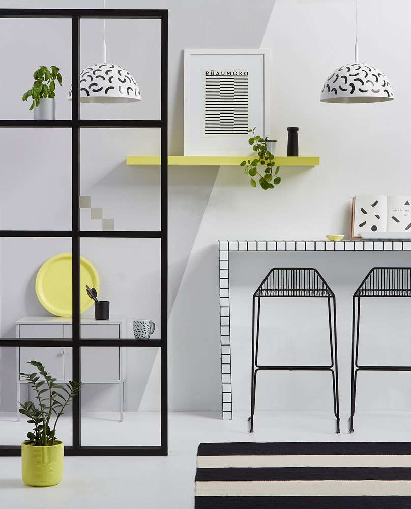
A commitment to a strict colour palette, with smart use of contrast, has resulted in a quirky room that verges on being an optical illusion. The rear wall is painted in Resene Double Concrete on the left and Resene Eighth Black White on the right. Floor in Resene Half Concrete, grid screen stained in Resene Colorwood Pitch Black, console table and lightshades in Resene Eighth Black White with Resene Blackjack, shelves, tray and floor planter in Resene Canary and small pot on screen in Resene Double Concrete. Rug from The Ivy House, bar stools from Cintesi, cabinet from IKEA, artwork from Endemic World. Project by Kate Alexander, image by Bryce Carleton.
If you’re unsure how to pull together a colour scheme for your quirky look, start with the colour wheel Rebecca says. It’s a fail-safe way to choose a colour palette that appears simple but works well in layers for added interest and complexity.
“For a subtle approach to using the primary colours, red, yellow and blue, start with a neutral base of Resene Double Alabaster and add touches of colour for impact. Introduce Resene Spotlight to your front door for a boost of optimism, create a cosy, TV nook by deepening your lounge walls with Resene Space Cadet or introduce a pop of red into your kitchen by updating your kitchen drawer handles with Resene Red Hot.”
These primary shades can give your house a delightful retro, pop-art feel. To expand the palette further you can then look to secondary colours like orange, magenta and green.
“Bring energy to your hallway by coating the walls in Resene Sunrise, introduce a softness to your bathroom with a feature wall in Resene Moody Blue and add a Resene Lemon Ginger doormat to your back door.
“For a softer look Resene Kumutoto is a coastal blue that brings a sense of serenity to your bedroom paired with the milky, Resene Half Merino. Coat all four of your walls in Resene Kumutoto for the ultimate escape or simply refresh a pair of side tables with Resene Kumutoto and coat your walls in Resene Half Merino for a subtle approach,” Rebecca says.
Once you have the key colours for your walls, furniture and fittings, look for ways to add pops of those colours to other decor pieces to make the finished palette seem completely intentional. It might be as simple as taking the unexpected teal Resene Retro you’ve used on kitchen cupboards and using it on the wooden tray you serve drinks on or repeating the colour of your coffee cups and picture frame.
“Always look for unexpected places to add colour and experiment with bold, playful patterns to add an additional quirky chic element to your home.”
For Resene Colour Expert Meryl Southey, the signature design elements of a Wes Anderson look are these pops of primary colours along with frequent use of pastel hues and vintage themes which can be introduced through art, accessories, or statement walls.
“One or two combinations which embrace the theme will do the trick. It is about using accents in a room that echo the director’s – or your – iconic style.”
Meryl suggests trying whimsical colour combinations like dusty rose Resene Wafer, bold fuchsia like Resene Drop Dead Gorgeous and milky beige Resene Urbane with a touch of dark Resene Espresso to evoke drama into a room.
Mid-century vintage is a common motif in Wes Anderson movies and is enjoying an interior style revival already. “Highlight mid-century schemes with neutral walls painted in hues such as Resene Sea Fog, Resene Soothe and Resene Stonewashed paired with bold coloured furnishings and a dramatic statement wall in bolder colours such as Resene Clockwork Orange and Resene Galliano,” Meryl says.
For a more pared back vintage look that still offers a unique whimsical finish, she suggests considering blonde-on-blond colour schemes paired with dark hunter greens, and pops of primary colours. “Pair the look with organic materials, native wood and rich bronze metallics. Colours to try are Resene Creme De La Creme, Resene Rice Cake, See The Light, Resene Off The Grid and Resene Rudolph.”
If you prefer a more biophilic-inspired style of quirkiness, Meryl suggests adding a youthful twist with splashes of a sky blue like Resene Refresh, delicate pink Resene Cupid or sunny Resene Energy Yellow against olive greens like Resene Highball or Resene Nirvana.
Layering similar tones of green is another common feature of the Wes Anderson look, Meryl says. Try going for a pastel-on-pastel look with Resene Peppermint and Resene Kandinsky, finished with brighter Resene Anise, or go for a bold pop art look with Resene Groovy, Resene Tree Frog and Resene Japanese Laurel.
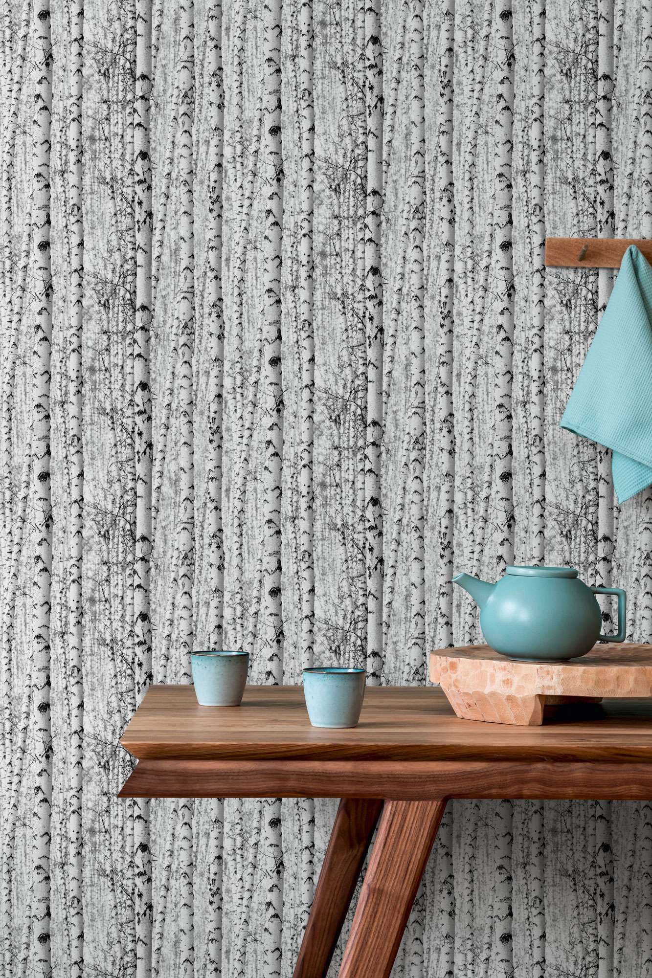
A mix of texture and pattern with bold intentional colour choices are the foundation of creating a space that is visually unique and personal to you. Resene Wallpaper Collection 38719-1 provides a stunning backdrop to the sleek wood and pretty teal blue decor. Team with the warm copper wood tones of Resene Colorwood Japanese Maple against the fresh blue of Resene Idyllic.
If there’s a word of caution in using someone else’s famous style as your source of inspiration, it’s simply to remember to make it your own. You can copy or pay homage to a certain look as much as you like but be sure to add your own simple touches to reflect your taste and design flair. It may be as simple as adding in your own beloved decor pieces or a unique upcycled second-hand find.
That way you’re creating a room for you, your family and friends, and not just creating a museum-style tribute to someone else.
One of the fun things about decorating with paint is that if your taste changes, or something just doesn’t work, it’s not a huge, expensive job to change colours and try something different. Have fun experimenting!
Need help choosing your colours? Visit your local Resene ColorShop, ask a Resene Colour Expert online, www.resene.com/colourexpert or book a Resene Colour Consultation – virtually, in-store or at home, www.resene.com/colourconsult.