Achromatic is a word that is cropping up more frequently in design conversations as a popular framework for stylish contemporary design.
It may sound new, but most of us will already be familiar with achromatic design as we know it by another name – monochromatic design.
Monochromatic is a word often used to describe the use black and white, whether that’s in art, photography or other areas of design. In fact, monochromatic means simply using one colour, although it could be in varying shades of that colour. And it can be any colour, rather than being restricted to black or white.
Achromatic means simply without colour, so refers to the use of shades of black, white and grey.
Start your property search
Resene colour expert Jackie Nicholls describes achromatic colour palettes as “neutral and stylish”.
“The appeal of these schemes is that they are modern, fresh and light. People feel that by keeping things neutral, they won’t make mistakes and they can add their colours afterwards with accessories and furnishings, which can easily be tweaked or swapped out for others over time.”
Podcast to listen:
The only thing to be careful of is that going too stark with your blacks and whites can result in a look that is a little sterile and unimaginative, she says.
To offset that Jackie suggests working with layers of texture with distressed finishes and sumptuous textiles that will soften the overall look.
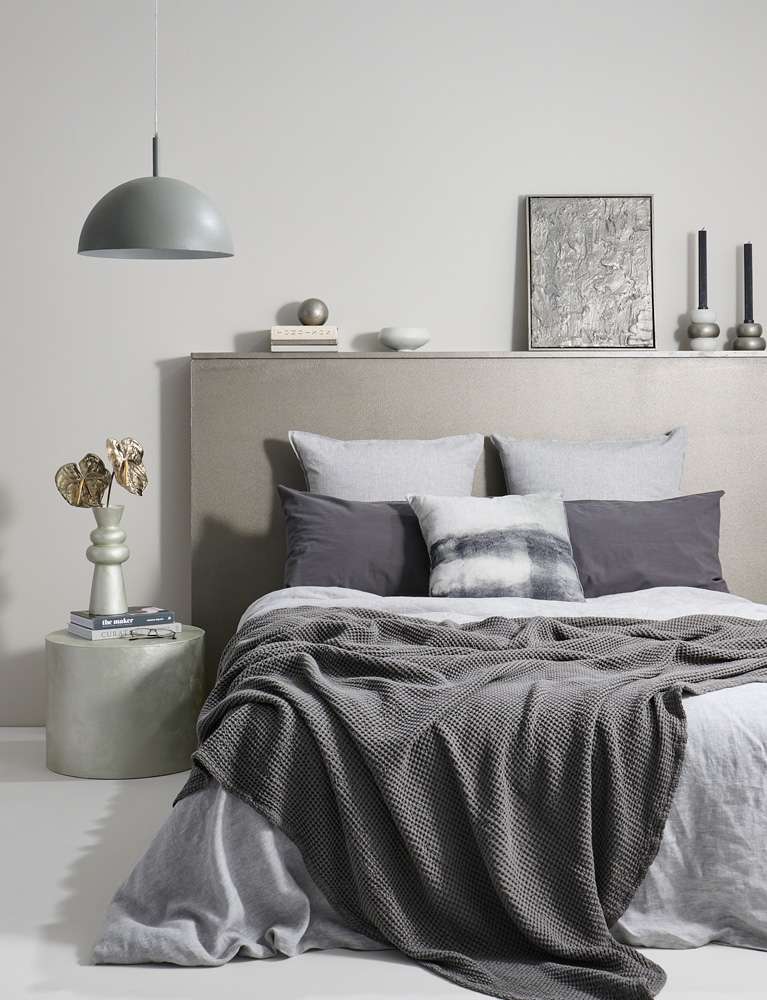
“Although it is essentially a black and white scheme, using gentle undertones will give a touch of warmth and character, while using some dark accents here and there will create drama and contrast,” she says.
For example, rather than a stark white and a classic black try slightly “off” shades like off-white, near-beige Resene Biscotti with charcoal Resene Bokara Grey and add trims and decor pieces in a fresher cream like Resene Pearl Lusta.
To veer further from a strict achromatic palette while still honouring the spirit of it, switch your charcoal shade to an almost-black grey-blue like Resene Atomic.
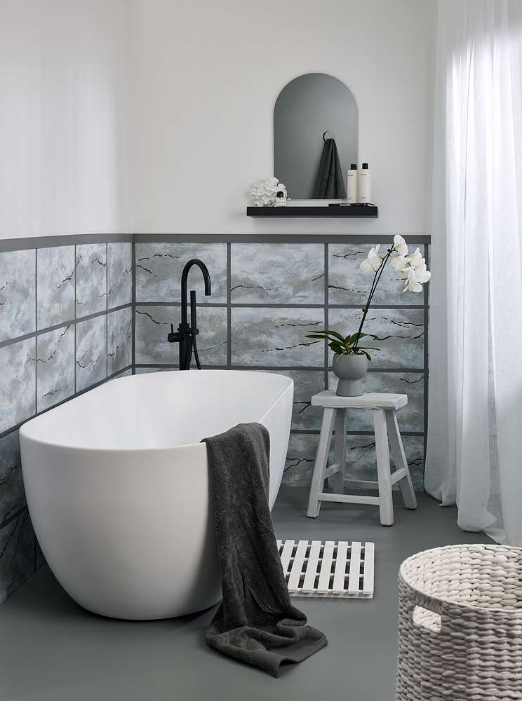
Faux marble tiles add chic sophistication and visual interest to an achromatic bathroom. The floor is painted in Resene Double Stack with upper walls in Resene Alabaster. Marble tile effect base in Resene Double Stack base with hues of Resene Alabaster, Resene Eighth Stack, Resene Half Stack and Resene Half Baltic Sea painted on top to create the marble effect. Dado line in Resene Double Stack, shelf in Resene Invincible, basket and mat in Resene Alabaster, stool in Eighth Stack and orchid pot in Resene Half Stack. Bath and tapware from Plumbline, bath products from Father Rabbit, towel from Bed Bath & Beyond. Project by Melle van Sambeek, image by Bryce Carleton.
The holistic approach
Making sure your achromatic palette feels alive and lived in, it’s important to consider the whole space, Jackie says.
“Other features of a room like carpets, hard floorings or kitchen finishes will add another level of interest and warmth to an achromatic space. Achromatic wall shades should be chosen with these in mind to get the best effect and to make the space feel connected.”
Light levels in your space will also make a difference to how warm or cool an achromatic palette will feel, she says.
Think about a mix of matt, gloss and semi-gloss finishes on your surfaces, whether that’s floors, walls, ceilings, cabinetry or trim. Each gloss level will reflect light differently, so using a mix of finishes can help soften a simple achromatic palette and help add visual texture.
A lot of high gloss finish and reflective surfaces like glass can make a room feel slightly sharper and brighter, which can work really well in spaces like kitchens and bathrooms. Wider use of matt finishes will make a space feel softer and cosier.
Faux marble tiles add chic sophistication and visual interest to an achromatic bathroom. The floor is painted in Resene Double Stack with upper walls in Resene Alabaster. Marble tile effect base in Resene Double Stack base with hues of Resene Alabaster, Resene Eighth Stack, Resene Half Stack and Resene Half Baltic Sea painted on top to create the marble effect. Dado line in Resene Double Stack, shelf in Resene Invincible, basket and mat in Resene Alabaster, stool in Eighth Stack and orchid pot in Resene Half Stack. Bath and tapware from Plumbline, bath products from Father Rabbit, towel from Bed Bath & Beyond. Project by Melle van Sambeek, image by Bryce Carleton.
Top tip: Using a matte or low sheen finish like Resene SpaceCote Flat or Resene SpaceCote Low Sheen with a dark achromatic shade like grey Resene Tuna can lend it a suede-like finish that adds a sense of luxury and opulence. For a similar effect with slightly more colour while remaining neutral try the deep beige of Resene Stonewall.
It’s also a good idea to consider the current feel and location of your house, Jackie says.
“An older house may look very cold if the colours are too white and rooms that are on the cold side of a house usually benefit from colours with a bit more depth and warmth.
“Resene has colour experts who can help you find the right whites to try at your
place as every home is different. The colours may all look the same at first, but some will have undertones of yellow, pink or green which may not be apparent until you sit them next to your flooring and other finishes,” she says.
Top tip: Instead of painting Resene testpots directly onto the wall, paint them onto A2 leaving a 3cm border without paint. Hold the painted swatch up against the wall in different places at different times of the day to see how each of your achromatic shades looks in the lights.
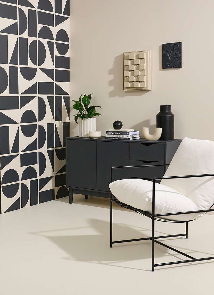
Achromatic design doesn’t need to mean stark black and white. Warmer tones of off-white and charcoal can help soften and personalise the look. These living space walls are painted in Resene Parchment with side mural in Resene Foundry. The floor is painted in Resene Half Parchment, cabinet and small artwork in Resene Foundry, light artwork, U-shaped vase, and planter in Resene Triple Parchment and ball decoration and tall vase in Resene Black. Chair from Freedom. Project by Vanessa Nouwens, image by Bryce Carleton.
Achromatic plus one
One of the most fun ways to play with achromatic palettes is to bend the rules and add in just one other colour.
It can be a really effective way to add drama and personality to a room. Choose either a bright contrast or a more subtle harmonising tone and you’ll not only draw the eye to that shade, but it will draw attention to your whole, carefully curated achromatic palette.
For brighter whites and true blacks like Resene White and Resene Black add accents in deep red Resene Dynamite or fresh yellow Resene Half Melting Moment.
For tonally similar neutral layers, that almost, but do not quite venture into colour, try grey-tinged white Resene Double Alabaster, with warm grey Resene Delta and green-toned beige Resene Bison Hide.
For a more muted look try off-white Resene Blanc with dark Resene Black Rock, with an accent of coppery brown Resene Moccaccino or the more subtle neutral of Resene Eighth Colins Wicket.
Jackie’s achromatic shades to try include:
For help bringing an achromatic colour palette into your home, visit your local Resene ColorShop or book a colour consultation online, www.resene.com/colourconsult.