A splash of new colour on the walls inside a home is not only good for the eye but, according to a leading paint specialist, it can also be great for self-care.
Davina Harper, Dulux colour specialist, believes it is important to surround yourself with colours that help you feel positive because “colour and mood are intimately connected.
“The world outside this year has been challenging,” she says. “Changing the colour of your walls might seem fairly insignificant; however it’s all part of self-care and surrounding yourself with uplifting hues to help you feel secure and comfortable during difficult times.”
Harper says the Dulux 2021 Colour Forecast offers plenty of choice. Based on virtual research into global design trends it features colours drawn from nature including brighter, oceanic shades of blue-green and coral, muted botanical greens, warm whites and soothing mauve-greys.
Start your property search
“Whites and pale neutrals might feel like the safe choice, but they might not always be the best choice,” she says. “Richer hues can add depth and interest to a space and make a house feel like home.”
She says the simple use of colour has a lot of power. “You can use colour to make your home whatever you need it to be, whether that’s refuge, relaxation or nostalgic memories of past adventures; there are no rules – just follow your instincts.”
To demonstrate what a huge impact colour can have - and how little time and effort it takes - stylist Bree Leech introduced bold colour to rooms in a predominately white 1970s home.
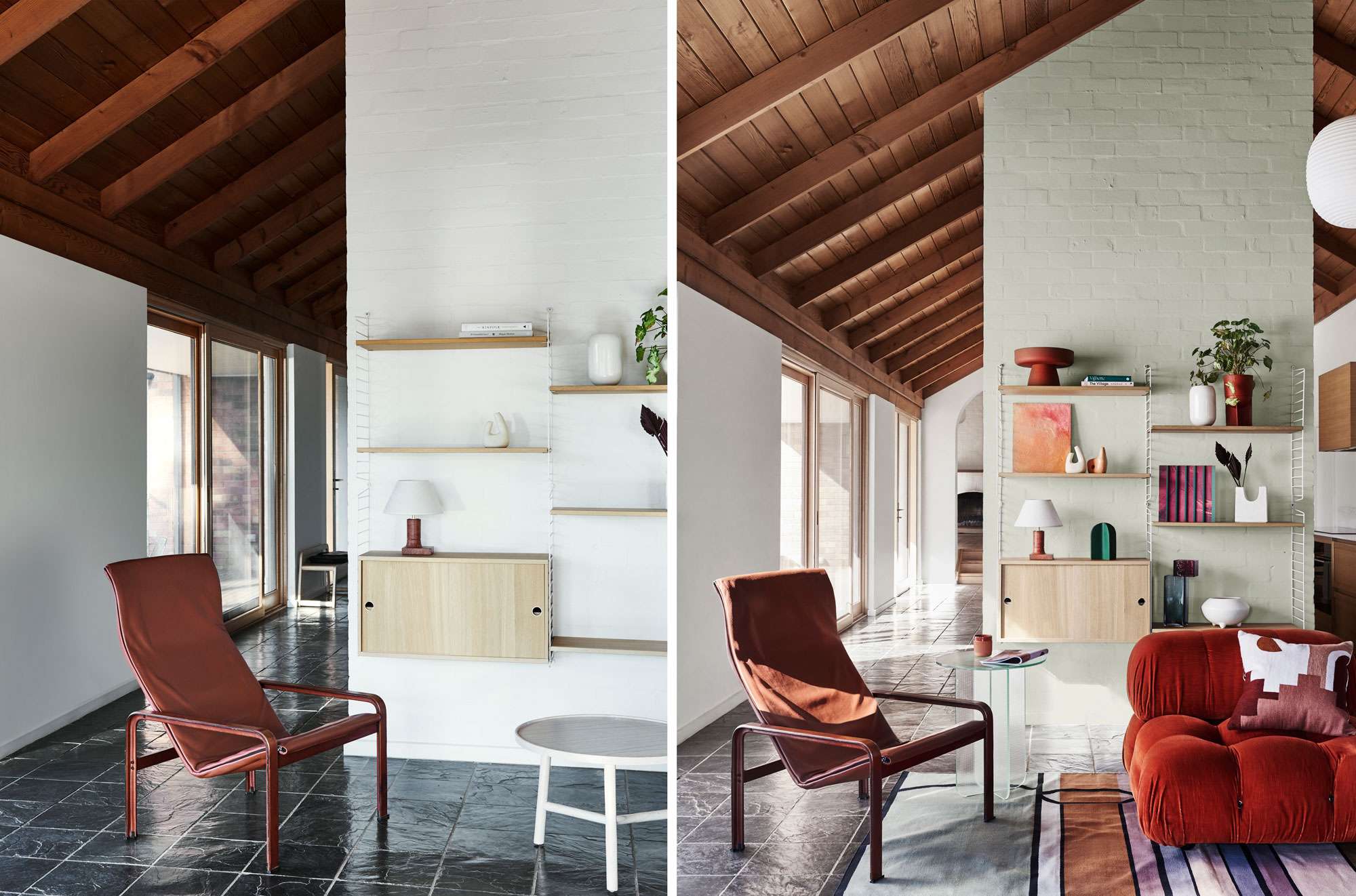
Living room before (left) and after (right). After images features Dulux Woods Creek (front wall), Mt Aspiring Half (back wall). Styling: Bree Leech, artwork on left by Ria Green and artwork right by Taj Alexander – Modern Times. Photos: Lisa Cohen.
Choosing brighter and uplifting colours from the Dulux palette, Leech says she wanted to show how to create an entirely new look with little more than a paintbrush.
“This light-filled house is brimming with character features including a pitched timber-lined ceiling and arched doorways,” she says. “While the all-white interior was neutral and unassuming, adding colour helped highlight the best features and really brought the rooms to life.”
Leech, who added a few décor items to complete the new colours, chose a deep blue-green (Dulux Wash&Wear in Cook Strait) for the dining room amplifying the features of the room such as a rustic brick wall, archway and timber lining.
“We painted the inner part of the arch in a neutral white (Dulux Wash&Wear in Mt Aspiring Half) to further accentuate the curve and carried the colour scheme through to the adjoining hallway. Little touches such as a round blue-green cushion on the bench seat to match the dining room wall created a flow of design between the two areas,” she says.
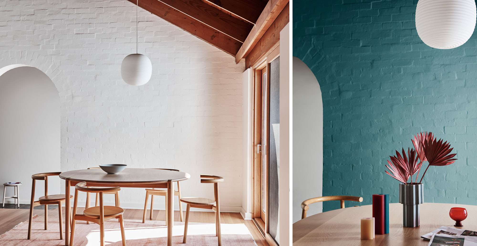
Dining room before (left) and after (right). Main wall colour Cook Strait, back wall colour Mt Aspiring Half. Styling: Bree Leech. Photos: Lisa Cohen.
In the living room, Leech used a gentler hue as the feature, highlighting the wall behind the shelving unit in subtle green (Dulux Wash&Wear in Woods Creek). She then dressed it up with a combination of artwork and vessels in tonal shades of peach and terracotta with pops of red and green.
For the kitchen Leech says she wanted even more warmth – and was inspired by its chilli red oven: “I saw this space as an inviting place for the family to gather and selected a warm palette to give it a different mood to the adjacent rooms.
“Painting the feature brick wall (in Dulux Wash&Wear Halfway Bluff) added that extra warmth without taking away from the best feature, the oven,” she says. “The accents on this wall didn’t need to contrast so I painted the shelving to match the wall and added an eclectic display of artwork and vessels in tonal shades.
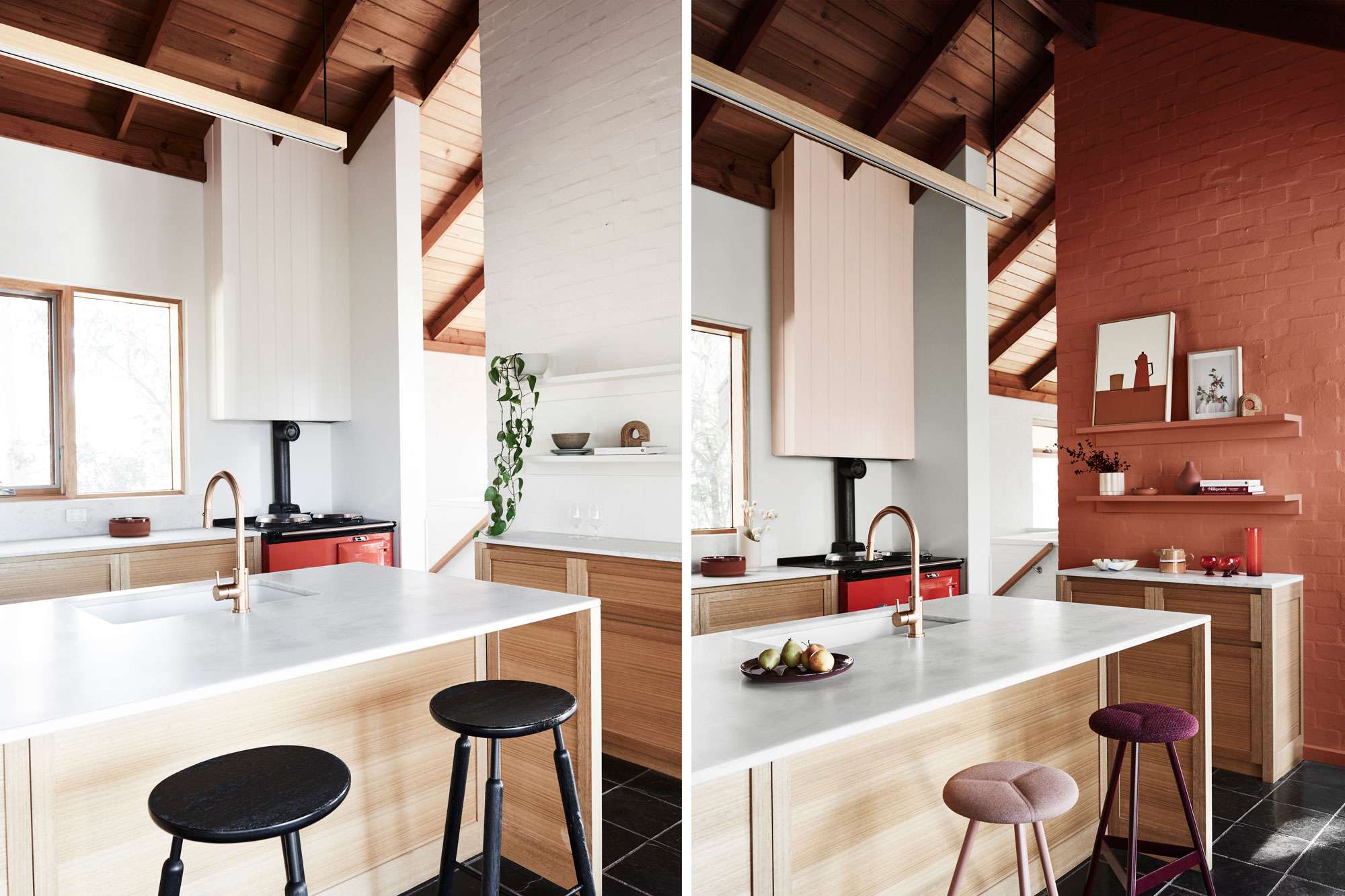
Kitchen before (left) and after (right). Main wall colour Dulux Halfway Bluff, back wall colour Mt Aspiring Half. Styling: Bree Leech, artwork (left) by Mark Alsweiler, artwork (right) by Ju Atkinson-Dunn – Studio Home. Photos: Lisa Cohen.
“To soften the contrast between the feature wall and the white in the room, I opted to paint the rangehood a gentle blush (Dulux Wash&Wear in Prebbleton).”
Leech says she completed the look by swapping out the black timber bar stools for seating in aubergine and blush. “I chose styles with soft cushioned seats to encourage those in the household to sit, linger and connect in the kitchen.”
To learn more about the Dulux 2021 Colour Forecast visit: www.dulux.co.nz
This content has been created in partnership with Dulux.


