Minimalism is an ever-popular approach to interior design, all clean lines and often pared back neutral shades. It’s popular for its simple sophistication and lends itself to sleek modern spaces. But it isn’t for everyone.
Most of our homes are filled with furniture, decor and art that we love and we want to surround ourselves with those things, along with the colours we love to create spaces that make us happy. Living in a ‘busier’ space doesn’t mean rooms need to feel cluttered or untidy. It all just takes a bit of thought and planning to make busier spaces feel just as sophisticated, stylish and satisfying as the sleekest minimalism.
Back to basics
Start your property search
When it comes to working with a range of bolder colours, instead of a strict neutral palette, to create a vibrant finish, Resene colour expert Meryl Southey suggests starting with the Resene Colour Wheel to find your inspiration.
The Resene Colour Wheel helps you see and understand the relationship between different colours so you can experiment with different colour combinations to see how they work together, and how they might work with the patterns or decor pieces in your rooms.
“It helps ensure your colour palette will give you the effect you want,” Meryl says.
Start out by sticking to all warm or all cool colours because they will naturally tend to work better together, she says. “That doesn’t necessarily mean a palette of orange, red and yellow for warmth or all blues, greens and greys for cool. Look at the undertones of the colours.”
For example, yellows tinted with green like Resene Switched On will be cooler than yellows tinted with orange like Resene Turbo. Blues tinted with reds like Resene Azure will be warmer than blues tinted with greens like Resene Awash. Resene colour charts and online tools have good descriptions of how a colour will appear, but if you’re not sure if colours are cool or warm, talk to the Resene colour experts in-store or Ask a Resene Colour Expert online, www.resene.com/colourexpert.
As well as combinations of colour, it’s also a good idea to think about how different sheen levels in your painted finish will impact the finish look and how different shades and patterns work together, Meryl says.
“If you are using a strong colour palette, a flat or matt finish will help to create a more relaxed casual vibe. A shiny finish will create a more luxe look and it can make the colours seem more intensified.
“Resene colour chips on the charts and fandecks are finished with Resene SpaceCote Low Sheen, and the Resene The Range fandecks come with a gloss indicator which is a handy tool to see how the same colour will look in a gloss finish,” she says.
Using too many different gloss levels can add to the busyness of a finished look, but adding a high-gloss finish to one surface can also be an effective way of creating some visual relief when using a lot of one colour.
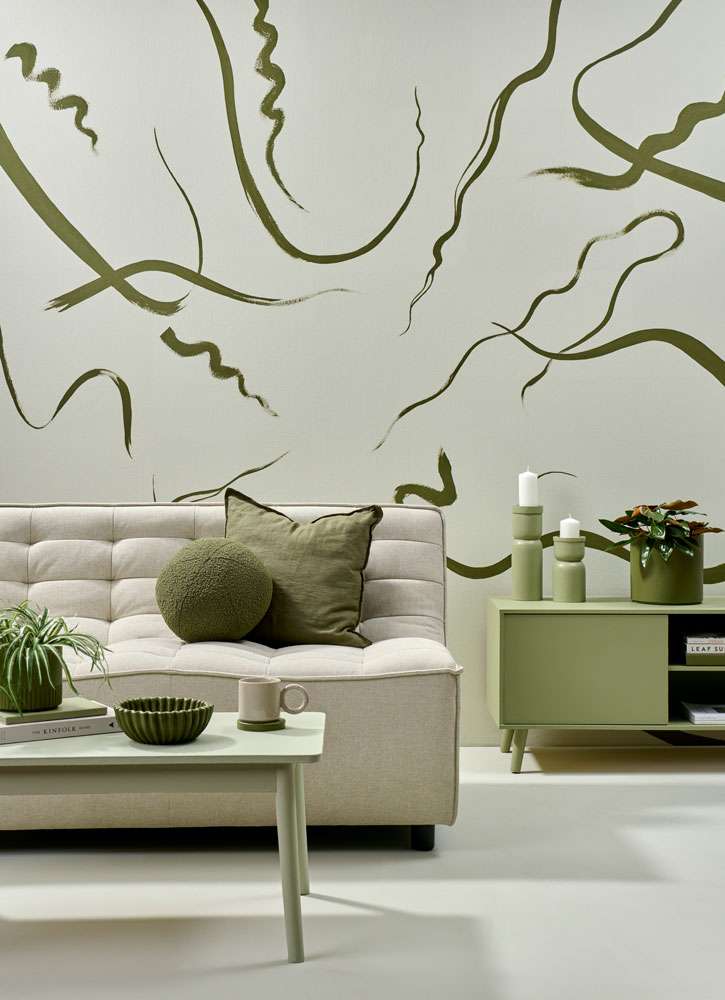
A pale pastel can work like a neutral in a colour themed room, while some creative touches add movement and personality. The walls and floor are painted in Resene Moon Mist, with painted streamers in Resene Waiouru, sideboard and candlesticks in Resene Flax and planters, coaster and ribbed bowl in Resene Waiouru. Sofa from Danske Møbler, round cushion from Adairs, linen cushion from H&M Home. Project by Vanessa Nouwens, image by Bryce Carleton.
Perfect patterns
When working with different, ‘busy’ patterns like delicate florals or repeating geometric shapes, Meryl suggests varying the shape and scale so there is some relief for the eye, but make sure the patterns have a common element such as colour, so the look feels cohesive and connected.
“You can also look at repeating one of your patterns throughout the house but in different applications. For example, you might have a diamond pattern on a fabric in the living room, which can be repeated as a Resene wallpaper in the entryway and a paint effect on the ceiling in a powder room. This creates a nice flow for the eye to pick up.”
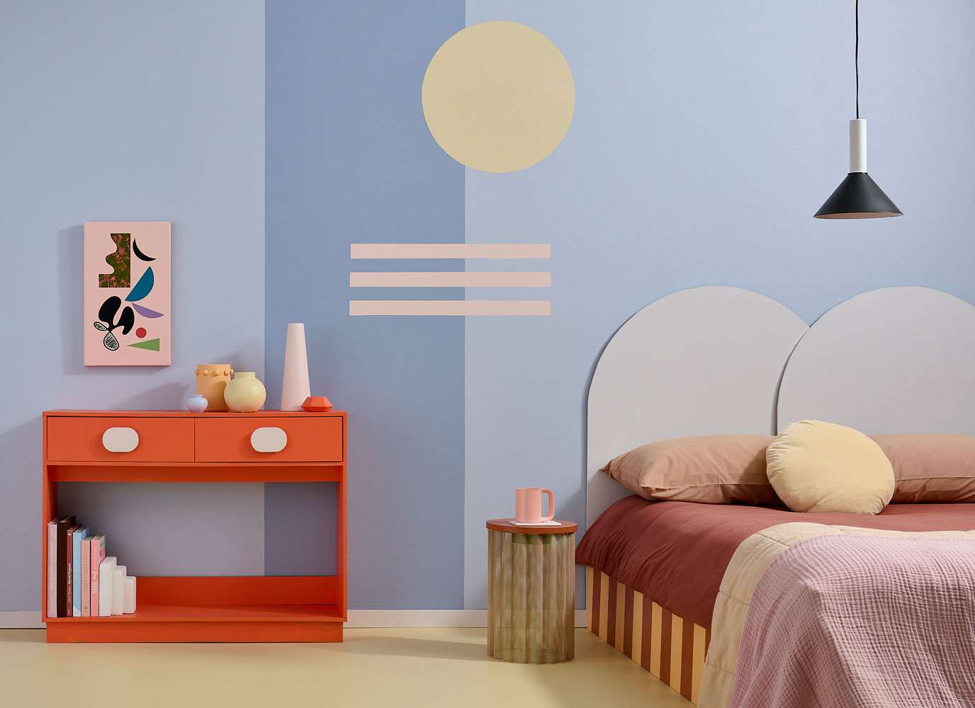
Simple shapes in complementary shades are a simple, effective way to add personality to a room. Choose your colours from art pieces or furnishings for a pulled-together finish. This floor is painted in Resene Hampton with rear wall in Resene Oxygen. The darker strip is Resene Smokescreen, with stripes in Resene Inspire and circle in Resene Hampton. The sideboard is Resene Big Bang, the side table top is Resene Wild West, the bedhead is Resene Snowdrift and the light fitting is Resene Blackjack. The vases are, from left, Resene Smokescreen, Resene Consuela, Resene Hampton, Resene Inspire and Resene Big Bang. Bed base painted in Resene Consuela and Resene Wild West. Artwork by Jodi Clarke from endemicworld. Project by Kate Alexander, image by Bryce Carleton.
A place for neutrals
Neutral paint or wallpaper colours are definitely not just for the minimalists among us. There is a reason they always dominate the Resene Top 20 most popular shades. When it comes to busier, more stylishly ‘cluttercore’ interiors, neutral shades can be the perfect way to bring everything together.
“Neutral colour palettes are great with busier patterns,” Meryl says. “They have a calming effect, so it is easier to push boundaries.”
She also suggests re-evaluating what you consider to be a neutral. Beige tones and off-whites like Resene Half Tea or Resene Parchment are excellent for creating a blank slate from which to build your colourful, patterned and curated space, but deeper shades, subtle pastels and muted, desaturated colours can create interesting colour schemes that anchor a busy space without overwhelming it.
Midnight blues like Resene Carpe Noctem, charcoals like Resene Bokara Grey or deep greens like Resene Top Notch are not traditional neutrals, but used across large stretches of wall can provide a dramatic anchor to any decor and art collections, while still remaining in the background. Use a matt finish like Resene SpaceCote Flat for a luxurious suede-like look, particularly if your decor pieces include subtly shimmery metallics or light-reflecting glass pieces.
Darker colours can also make the walls recede from the eye, creating a sense of depth in the room while drawing your gaze to your treasured collectibles or art on display. You can accentuate this effect with the use of backlighting or subtle spotlights on your favourite pieces.
Pastel, barely-there shades like Resene Contented or Resene Springtime can have a similar effect. These pale colours work like neutrals in that they offer a blank canvas that showcases your decorative items rather than compete with them. Use the colours in your artworks or decor pieces and choose a pastel that is similar to tie the room together.
Top tip: Animal prints add real glamour to a more maximalist space and though they’re patterned, they often work like neutrals so don’t create chaos in your colour scheme. Try Resene Wallpaper Collection 751741
Meryl also suggests looking to nature for colour inspiration and ideas for using colours the way you might traditionally use a neutral. “Colours that appear in large amounts in nature, like greens and blues, can be used in a similar way in your home. They start to feel 'neutral' because they are repeating something familiar.”
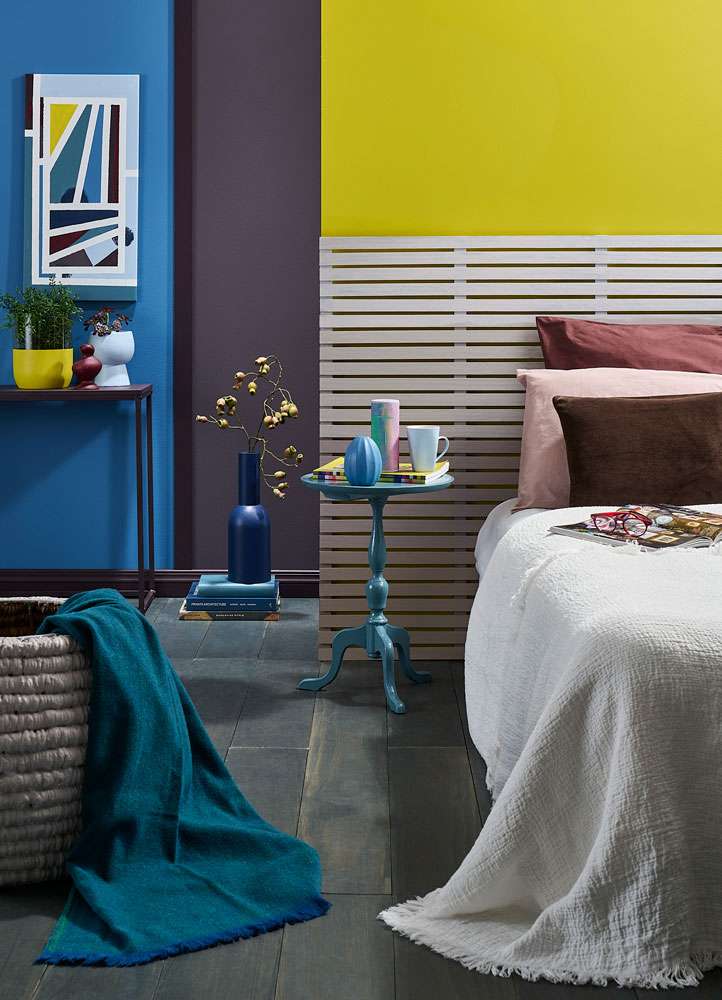
Multiple matching and complementary colours lifted from decor pieces and furnishings can work together well to create a vibrant, interesting, yet still cohesive space. Rear wall paint in, from left, Resene Kashmir Blue, Resene Chocolate Lounge and Resene Funk. Wood batten headboard painted in, top to bottom, Resene Urbane, Resene Martini, Resene Tom Tom and Resene Almond Frost. Floor finished in Resene Colorwood Shade, basket in Resene Martini, side table in Resene Streetwise, DIY artwork in Resene Kashmir Blue, Resene Funk, Resene Streetwise, Resene Midnight Express, Resene Spindle, Resene Caffeine and Resene Chocolate Lounge and pots and vases in, from left, Resene Funk, Resene Ravishing, Resene Spindle, Resene Midnight Express and Resene Streetwise. Bedlinen from Città. Project by Moneuan Ryan, image by Bryce Carleton.
Curation is key
When it comes to putting your finished room together, adding furniture, books, art, sculpture, photos and mementos, it’s all about layering - and curating - so you build up a room that feels thoughtful and reflective of you without just feeling cluttered.
Work with a layer of soft furnishings in rugs, cushions, curtains and throws and experiment with different textures and textiles, adding and subtracting items until you have a look you’re happy with. Work with items of a different size and shape and consider showcasing a single main piece as a focus of the room, and add other pieces around it that connect with that piece in some way through colour, shape, pattern or theme.
As you work, look for bare spots that need filling. If you have a full space, any neglected corners will start to pull attention from the rest of the room. And if you don’t know what to put in an empty spot, try a plant. Leafy greenery gives busy spaces a fresh note and can be the finishing touch that ties things together.
For those new to combining brighter, less traditional colour combinations, and worried the finished result could be chaotic or garish rather than sophisticated, Resene colour expert Jackie Nicholls says the best advice is to trust your inner voice and follow what resonates with you.
“Don’t worry about what everyone else is doing or what anyone else will think. They are often just as afraid or unsure how to think outside the square, and in the end, it only really matters that you love the space,” she says.
Top tip: Bold colours can also be used in accent shapes or blocks to draw your eye to certain features of a busy room. Frame a sofa with a painted colour block on the wall behind it in a similar colour, do the same with picture frames, or paint an abstract shape behind a desk or dining table. This can be a really effective way to break up large stretches of wall, adding your personality and flair to your rooms.
Visit your local Resene ColorShop for everything you need to get decorating. And if you need more help bringing together your colour palette, book a consultation with a Resene Colour Consultant, www.resene.com/colourconsult.