Is your home interior in need of a refresh? Is your colour palette feeling old and your space feeling cluttered? It might be time to adopt some of the principles of a ‘barely-there’interior style.
This form of modern minimalism is all about simplifying your spaces, and designing with clear intent so every colour, design and decorating choice has had thought put into it.
‘Barely-there’ design is a move away from the austerity of strict minimalism toward a more relaxed yet clean style, that is warm. It’s about creating rooms that are inviting to be in without dominating your attention.
Intentional design
Start your property search
Resene colour expert Meryl Southey says today’s minimalism is about being intentional about the things you have in your home.
“That doesn’t mean you have to have empty white walls and minimal decor. Tonal colour schemes that incorporate warm tones and textures will create a space that brings warmth and positive energy.
“You can still add a pop of colour. Try out a colourful wall or two to add flair to your minimalist decor or add a textured surface to a wall with Resene Sandtex”.
Organic shapes and curves are another way to soften the harder edges of minimalism, and can be used to bring visual interest into your space without needing to add a lot of cluttered decor to make spaces attractive, Meryl says.
Invest in statement pieces such as a striking piece of art, furniture, or a graphic wallpaper such as Resene Wallpaper Collection 296517 that will display like a mural.
“Displaying decor that we use every day, such as ceramic bowls, wooden boards or trays can also add a homely feel to a space, but with purpose,” she says. The key is to add these pieces with intention so they add a point of visual interest, and don’t just look messy.
“Plants are also a great way to visually soften a room, even a hanging plant in an empty corner will lift a simple space.”
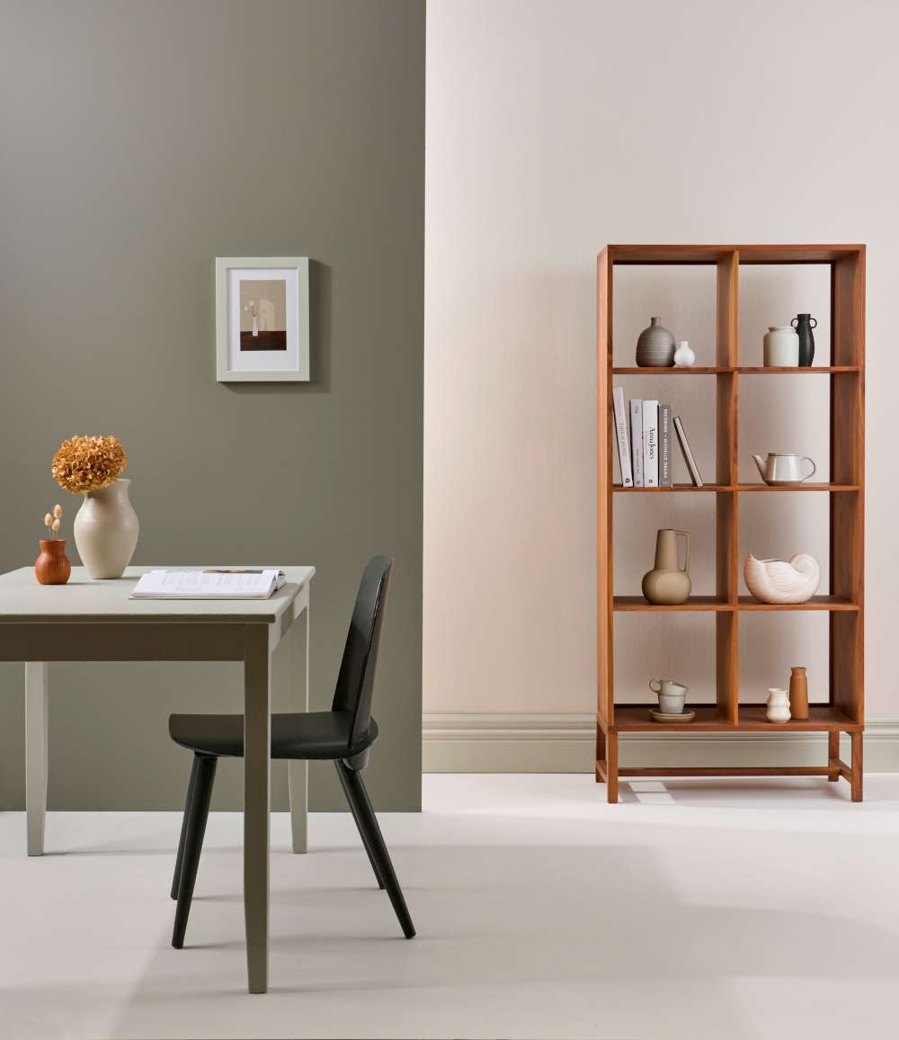
A mixed palette of earthy neutrals and greens gives this room plenty of visual interest without adding clutter. Floor in Resene Quarter Thorndon Cream with left wall in Resene Cobblestone and right wall in Resene Thorndon Cream, skirting in Resene Triple Thorndon Cream, dining chair in Resene Thunderstorm with table in Resene Half Lemon Grass, large vase in Resene Credence, picture frame in Resene Half Lemon Grass and on shelves, vases in Resene Quarter Thorndon Cream, Resene Cobblestone and Resene Thunderstorm. Artwork from endemicworld. Project by Kate Alexander, image by Bryce Carleton.
The colour palette
Muted colours do work well in minimalist schemes, Meryl says. “Layering colours will give warmth and be more inviting than your traditional cool white minimalist schemes.”
She suggests trying colours such as creams like Resene Triple Rice Cake or Resene Meringue, layered with soft beiges like Resene Foundation or Resene Tua Tua, and deeper salmon browns such as Resene Otter or Resene Domino. Accent with espresso browns such as Resene Trek, Resene Dark Chocolate or a near black such as Resene Half Bokara Grey.
This ideaof layering tonal shades also works with less neutral shades and allows you to work with colour while still allowing for the subtlety of a ‘barely-there’ design style.
For a fresh botanical finish, try Resene Quarter Blanc as a neutral base or trim with soft greens in Resene Pale Leaf, Resene Soft Apple and Resene Caper. These pastel greens add an airy summery feel to a room without the colour scheme dominating. If you want a bolder accent note, try the darker forest green of Resene Dingley or a contrast in the peach sorbet tones of Resene Glorious.
Another muted palette to consider for a warmer take on minimalism is greyed blues. Pair these with floorboards or other wood surfaces finished in Resene Colorwood Whitewash. Try tonal layers of Resene Quarter Duck Egg Blue, Resene Half Duck Egg Blue, and Resene Duck Egg Blue for a gradient effect that adds depth and interest to a room. Add a crisp note of Resene Half Black White and a teal accent in Resene Unite for a sophisticated but relaxed coastal feel.
The other shades that almost by definition work with a ‘barely-there’ design style are nude hues. Try layers of subtly pink shades that are almost neutrals, like Resene Half Sauvignon or Resene Half Pot Pourri. Add layers of deeper blush pinks like Resene Soothe or Resene Dust Storm with a warm white like Resene Umber White and an earthy contrast in Resene Half Wood Bark or Resene Half Forest Green. Nude or slightly blush pink tones also work well with plenty of plants and leafy green tones like Resene Haven and Resene Flax.
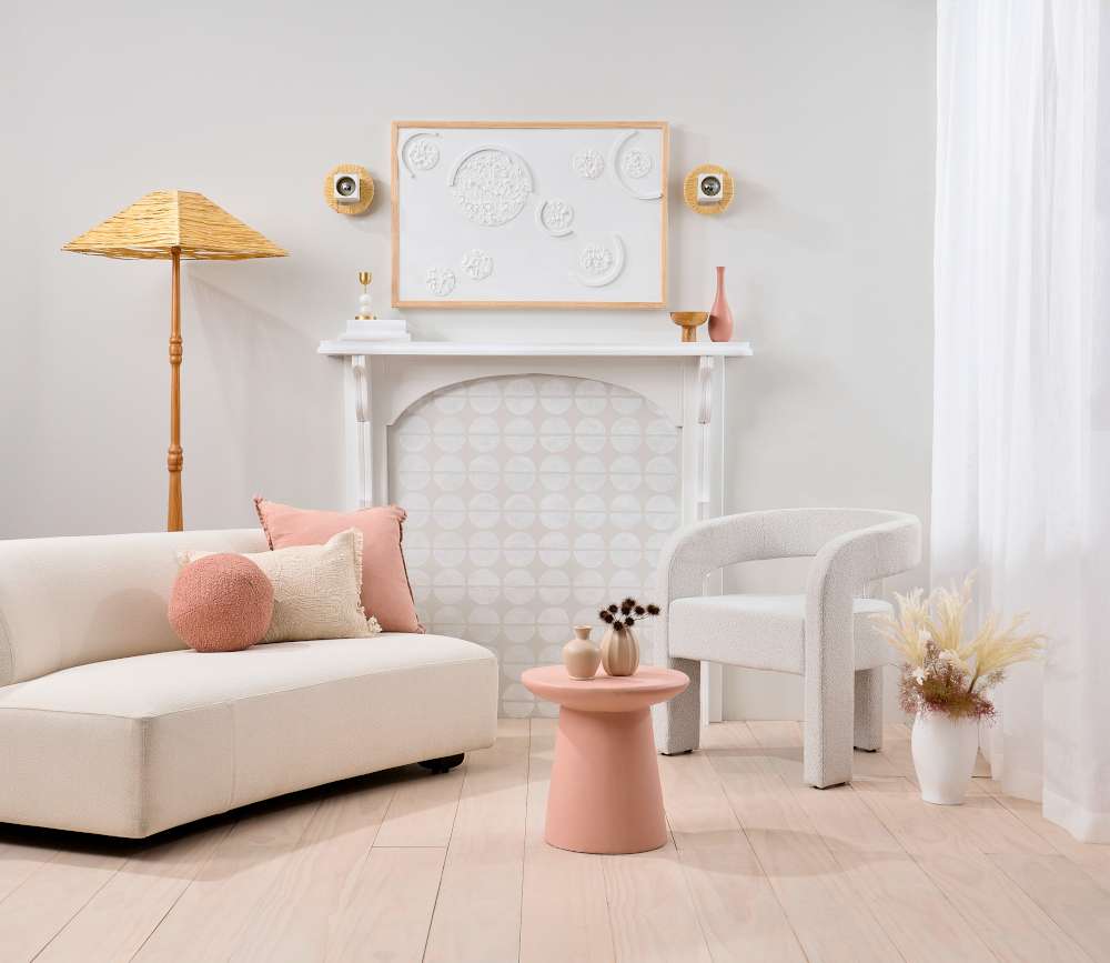
Textured finishes and considered pops of colour warm up this otherwise neutral room. Walls painted in Resene Triple Back White with floor in Resene Colorwood Breathe Easy, fireplace surround in Resene Half Black White with interior in Resene Eighth Black White and stencil design in Resene Triple Black White, table in Resene Awaken with vases in Resene Sour Dough, tall vase on mantel in Resene Summer Rose and large floor vase in Resene Eighth Black White. Sofa from Soren Liv, chair from David Shaw, lamp from Sailor and Scout, ball and pink cushions from Adair, cream cushion from Baya. Project by Melle van Sambeek, image by Bryce Carleton.
Starting in neutral
If you’re not sure about where to start with a ‘barely-there’ or minimalist colour scheme, whites and neutrals are a good go-to.
The Resene Whites & Neutrals colour collection makes it easy to build a tonal-layered look for a minimalist finish. The cards in the collection are arranged in their different strengths. Some of the most popular whites and neutrals come in up to six different strengths, so you can add a little depth and interest to update a white-on-white look by layering some of these shades.
For a warmer white-on-white look try yellow-toned neutrals like Resene Quarter Solitaire, Resene Gin Fizz and Resene Half Solitaire. An accent in deep wine red like Resene Aubergine on a single furniture piece will add drama without overwhelming your otherwise ‘barely-there’ look.
Using Resene whites and neutrals this way can result in a tonal scheme in its purest form which can then be the backdrop for adding accent colours or textural furnishings as your confidence grows. It also means you can swap in pieces like a cushion, a throw, or an art piece to change up the look with ease.
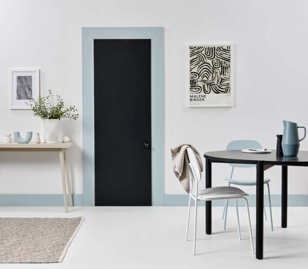
Trim and accent decor pieces in muted blues soften the edges of this otherwise classic monochrome dining area. Floor painted in Resene Double Sea Fog with wall in Resene Quarter Sea Fog and trim in Resene Half Dusted Blue, door in Resene Black Sand, dining chairs in Resene Half Dusted Blue and Resene Quarter Sea Fog, sideboard in Resene Triple Sea Fog with irregular shaped vase in Resene Double Sea Fog and U-shaped vase in Resene Half Dusted Blue and jug on the table in Resene Baring Head. Table from Bauhaus, artwork from endemicworld. Project by Kate Alexander, image by Bryce Carleton.
Texture and textiles
If you’re keeping to a very neutral or simple minimalist colour range, there are ways to add visual interest without adding clutter.
Subtle use of textures, whether it’s in your window dressings, a cushion, a lampshade, a subtly textured Resene wallpaper or wooden battens on the walls, will help your eye see the boundaries and dimensions in the room.
There are some beautiful modern wallpaper designs that can help add visual texture to your room that is still subtle. Try the neutral lime washed effect of Resene Wallpaper Collection 407358 or the nude-hued linen-look of Resene Wallpaper Collection 536171.
Addinga leafy green plant or something in an organic or soft curved shape is another way to add a bit more of a relaxed, welcoming finish to your space. It’s another way to connect your interior with the natural world which is a key part of these ‘barely-there’ looks.
A ‘barely-there’ interior finish isn’t about strict rules or overly restricting yourself so every surface is clear and uncluttered. It’s simply about being considered in the colours you choose, and the items you want to have in each space. It’s about creating a subtle, sophisticated vibe in a space that appeals at an almost subliminal level. It gives you the freedom to create spaces that you love and find inspiring, rather than simply going withthe flow and without a plan.
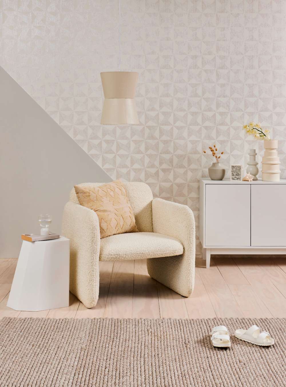
The geometric pattern of Resene Wallpaper Collection 36001-3, a diagonal wall design, the asymmetrical table and the curved chair add layers of shape as well as tonal colour in this sitting room. Diagonal section of wall painted in Resene Westar, floor in Resene Colorwood Whitewash, sideboard in Resene Half Rice Cake, lightshade in Resene Parchment and on the sideboard, vases in (from left) Resene Napa, Resene Black Haze and Resene Parchment. Chair from David Shaw, table from Everyday Needs, rug from H&M Home, cushion from Places and Graces. Project by Kate Alexander, image by Bryce Carleton.
For help getting started on your ‘barely-there’ palette, visit your local Resene ColorShop or book a Resene Colour Consultation – virtual, instore or at home (selected areas) - at resene.com/colourconsult.
Watch here: