Coming up with a colour scheme is half the battle with decorating – but knowing why two hues are visually appealing, and which one to use where, is the other half. If you end up using too much of one colour and not enough of the other throughout the space, you could end up with a much different mood than what you intended.
If you’re been in search of a new colour palette, you’ve probably seen a series of soft greens – namely, celery, sage and olive – popping up all over your social media feeds. Luckily, there are plenty of stylish ways to incorporate these soft, on-trend hues into your home. Try one of these tried-and-true combinations by bringing in some of Resene’s most fashionable paint colours.

Soft greens like Resene Peace (on the back wall) and Resene Suits (on the wall to the right) are grounded with a floor in neutral Resene Grey Chateau while the burgundy cushion and rug make a dramatic contrast and the pop of Resene Untamed (on the shelf) brings in some added interest. Styling by Gem Adams, photo by Wendy Fenwick.
Start your property search
Sage or Celery with burgundy
These particular greens sits across from burgundy on the colour wheel. This distinction makes them complementary colours, which makes the hues work well together thanks to their high contrast. But that said, which one you choose to put on a room’s largest surface – the walls – can make a significant difference in how the space will feel.
Dark, rich burgundy in the form of paint or wallpaper will make a small space appear smaller, but it’s a welcome shade if you’re after a sultry den or a warm and inviting entryway. Try Resene Smoulder, Resene Dynamite, Resene Salsa or Resene Courage.
Celery greens, such as Resene Smoothie, Resene Lemon Twist, Resene Mint Julip or Resene Arrowroot are gentle enough to use in bedrooms yet reflect enough light to make them work in busy kitchens and playrooms. For more saturated options, look to Resene Rococo, Resene Karma or Resene Gimblet.
Sage greens, too, work beautifully with burgundies, or even more vibrant reds. Try pairing Resene Bud with Resene Red Herring – which both have the same dusted quality. Or, try matching Resene Frontier with Resene Pohutukawa.
Another option is to use a neutral contrasting tone on the walls – such as a grey, a green-yellow beige or chalky off-white – and introduce this palette duo through other avenues, like painted furniture and accessories or textiles. Build a red-green complementary palette on top of Resene Eighth Stonewashed, Resene Yuma or Resene Quarter Tea to get the effect.
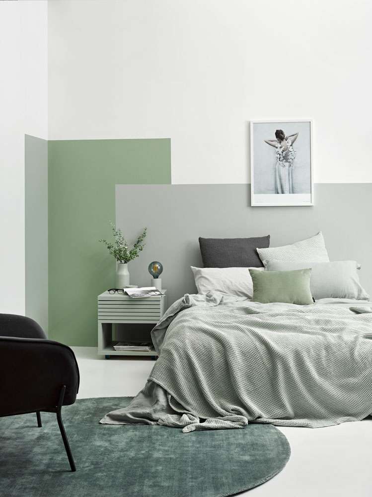
This tone-on-tone painted headboard feature was created with blocks of Resene Silver Chalice, Resene Peace and Resene Helix - a selection of similar greens and greys. Styling by Vanessa Nouwens, photo by Melanie Jenkins.
Sage with silver
Since tone-on-tone colour schemes are built on layering, the more you add, the more the whole scheme will hang together. The trick is to pick hues that complement with enough variation to keep things from becoming completely homogenous – and grey-greens like Resene Peace and Resene Helix are excellent to work with when you’re trying to create a restful space.
While this romantic-looking bedroom is certainly spilling over with similar shades of silvery green, it’s the clever use of repetition and contrast that really make it work. The expansive white walls and floors in Resene Alabaster have been grounded with a unique painted headboard feature in Resene Silver Chalice, Resene Peace and Resene Helix that echoes the rectilinear shapes of the pillows. The bedside table and vase in Resene Helix and the lamp in Resene Silver Chalice carry the tones of the colour blocks from the walls into the rest of the room while the dark charcoal cushion and velvet chair break things up visually and provide an anchor to this lofty look.
Other colours to try with soft silver-greens are dark jewel tones such as emeralds, sapphires and amethyst such as Resene Atlas, Resene Indian Ink and Resene Purple Rain.
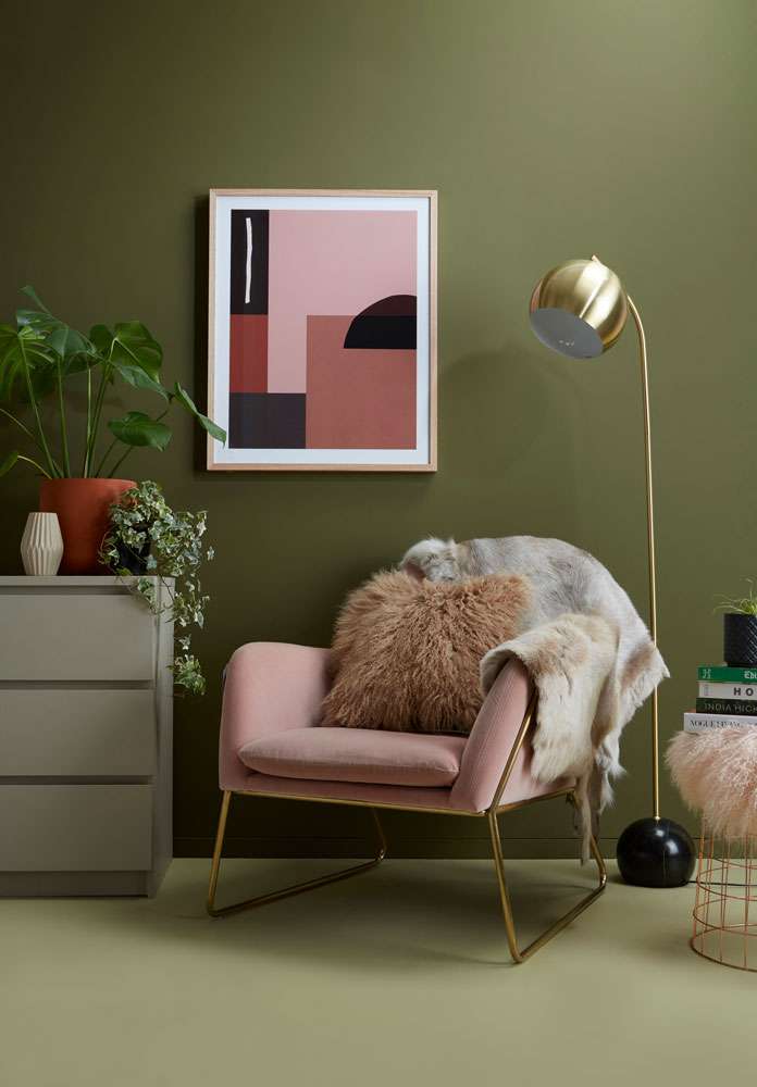
In the corner of this bedroom, both celery and olive work beautifully alongside blush and terracotta. The walls are in Resene Waiouru and the floor is painted Resene Bubble N Squeak while the chest of drawers is in Resene Napa. The plant pots in Resene Sunbaked (large) and Resene Double Ash (small) play into the artwork and tie together the whole look. Styling by Annick Larkin, photo by Bryce Carleton.
Olive and celery with Terracotta and Blush
Olive green varies greatly in saturation and temperature, giving you plenty of flexibility when decorating with olive green the colour is quite versatile. Cargo (or ‘army’) green, for instance, is a dustier version of olive – such as Resene Waiouru or Resene New Leaf – whereas others can venture more into chartreuse territory, like Resene Untamed, or a forest tone, like Resene Log Cabin. Whichever version suits you best, olive is the perfect hue to bring your living space into autumn.
Olive and celery looks excellent together with two other on-trend tones – terracotta and blush. For a scheme that’s plugged directly into the heart of what’s hot, go for one of these winning combos:
• Resene Waiouru + Resene Bubble N Squeak + Resene Sunbaked + Resene Soulful
• Resene Planter + Resene Mint Julep + Resene Raging Bull + Resene Just Dance
• Resene New Leaf + Resene Smoothie + Resene Fire + Resene Japonica
For more colour, paint and wallpaper ideas andinspiration see the latest looks online www.resene.co.nz/latestlooksor visit your Resene ColorShop.
This content has been created in partnership with Resene.