There is a graph that's been making the rounds online. And it makes for stark viewing for anyone who owns property in Australia.
Graphs are extremely powerful — this one is more powerful than most. It shows Australia is weird.
Australian house prices have been getting more and more expensive relative to personal disposable income — but it does not have to be that way. On average, in a large group of rich countries, the opposite is true: houses are getting easier and easier to afford.
Each line on the graph shows the ratios between two indexes — the house price index and the per capita income index. They are set equal to each other in 1975 and what we see depends on growth since.
Start your property search
When I first saw this graph, I was gobsmacked. Then I began to have doubts. Was it real? The version of the graph I saw was created by a top analyst called Gerard Minack. But still. It might have been wrong. That's often the explanation when a something amazing goes viral — it is surprising because it is false.
So I went back to the source data. I opened lots of spreadsheets and read the academic paper by the people that collected the data.
Conclusion? It looks legit. The reason Australia looks so different to the rest is that it has had only average income growth since 1975, but when it comes to house price growth, the nation is in a league of its own.
IS AUSTRALIA THE WORST?
The red line above shows Australia performs worse on affordability growth than a group of countries, all averaged out. It includes some big countries like Japan where house prices have fallen a lot.
Australia is worse than the combined group, but is worse than everyone in the group?
Yep! Of the 23 wealthy countries in their dataset, we have the highest ratio of house price growth to income growth between 1975 and 2018. (The dataset was made by two Americans back in 2011; it is not purpose-made to make Australia look bad.)
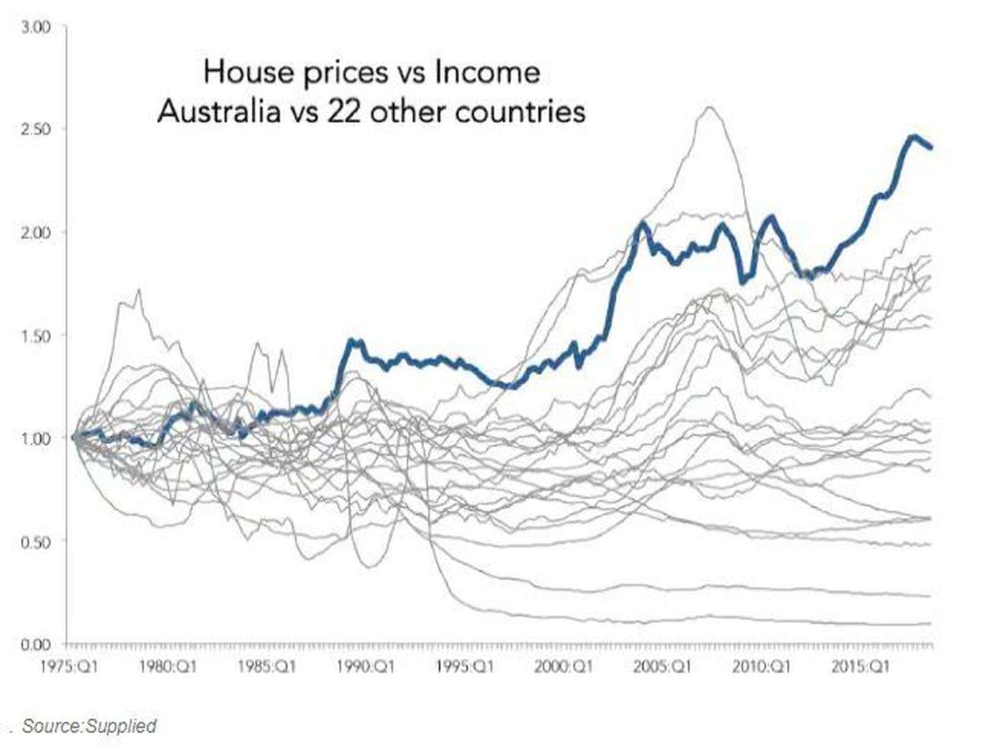
This next graph proves it. Australia (dark blue line) comes out higher than all the individual countries that make up that red line in the previous graph.
Australians face major challenges when it comes to housing security. Photo/Supplied.
Australians face major challenges when it comes to housing security. Photo/Supplied.
Notice though that with a graph like this, the start-date matters a lot. You set everyone equal at the start line. So if you start comparing house price growth to income growth in 1990 (a point where Australia is the leader of the pack in the 1975-based analysis), Australia doesn't end up highest. New Zealand, Luxembourg and Belgium go higher and Australia ends up fifth.
What really caught my eye in the above graph was that only one country had ever been higher than us on the graph. It soared up before it sunk back in 2007-08.
In this next chart I've cut out some smaller countries, such as Croatia, so we can see who is who more clearly. The country that soared above Australia is Ireland. And Ireland had an enormous house price boom that crashed in the global financial crisis.
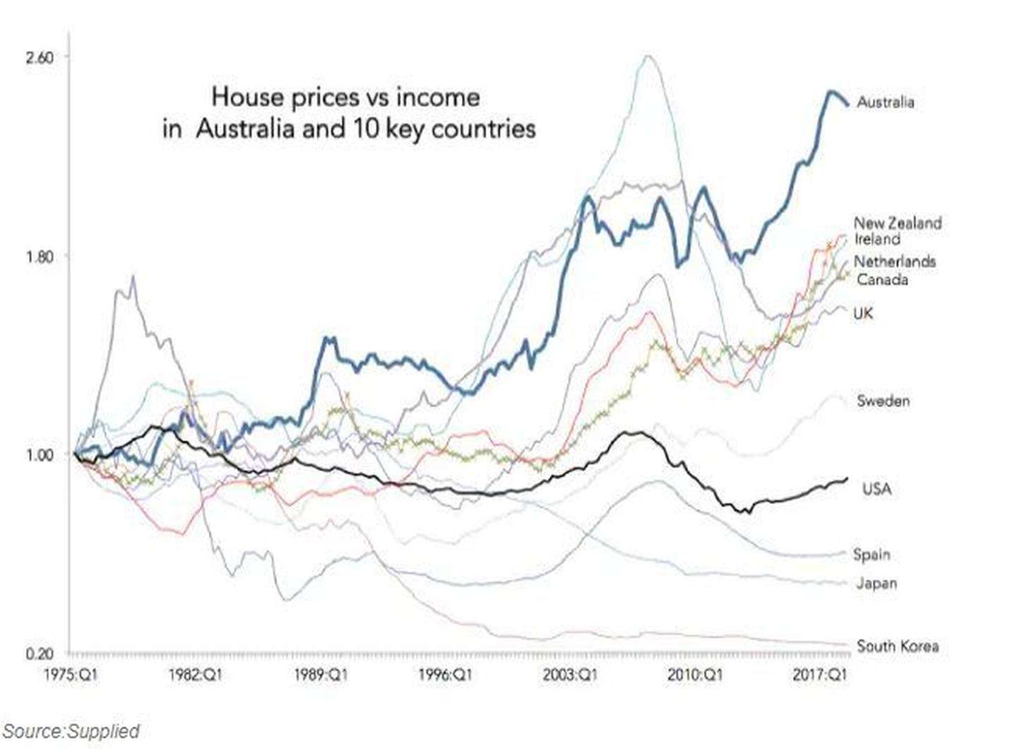
Is Australia going to follow Ireland and have the kind of house price crash that devastates the whole economy? It is not impossible. Prices have been falling in Perth for ages, in Sydney for over a year, and in Melbourne for nearly a year.
But there is an important difference between now and 2007-08. We are not in the midst of a global financial crisis. The kind of crazy global panic we saw in the GFC is absent.
Of course, it is not hard to imagine a crisis developing. Australia's house prices are falling. So are New Zealand's and Canada looks wobbly. US stockmarkets are falling too, and global interest rates are rising, putting pressure on any weak points in the global economy.
xxx
If you look at the graph above, you can see many of the lines are rising now, just as they were before the GFC. It looks ominous.
But we learned a lot from the GFC. Hopefully, we can stop it happening again. For now, the Reserve Bank of Australia is not worried about house prices falling and the government tells us our banks are well-financed and safe. We better hope they are right.'
- News.com.au
Jason Murphy is an economist. He writes the blog Thomas the Think Engine.


