After a long time spent living in a 1950s house in Mt Victoria renovated by Studio Pacific Architecture, their brief for this new project called for a more modest abode, one that would take shape as a dwelling for two but could also comfortably accommodate visitors. The pair had enjoyed their family’s early years in the harbourside suburb of Eastbourne and kept a vacant site there for some time. When they were at last ready to build on it, they called on Studio Pacific once again.
Referencing the great era of pavilion houses — specifically the Harvard Modern school and some of the most noted mid-century architects, such as Marcel Breuer and Richard Neutra — the result responds to both environment and site with a simple palette of concrete and timber that serves to preserve the design’s clarity and is a natural fit for the New Zealand aesthetic and local climate. In a bowl ringed with bush-clad hills that provide shelter from the prevailing winds, the new three-bedroom home sits on a slightly elevated platform that pushes back to the south- eastern corner of the property, creating open space to the north and a garden to the west.

Start your property search
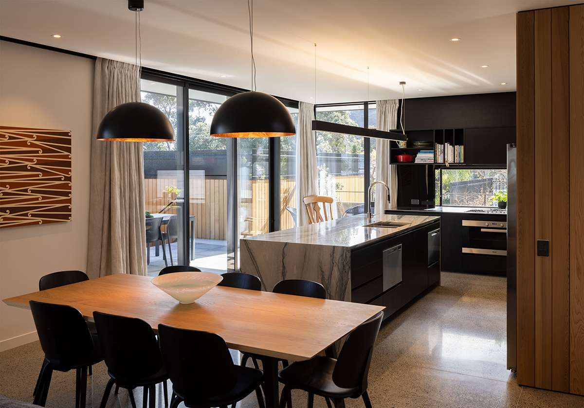
The open-plan main living space is surrounded by Metro Series windows and sliding doors that provide a physical and visual connection to the western terrace and sunken garden.
“Our clients previously owned a home with generous views over Wellington city and harbour,” says Studio Pacific senior associate Richard Beatson. “Although there’s no sea view here, being nestled into the surrounding neighbourhood context offers privacy and protective closure.”
The journey inside leads you through a courtyard, where you come into contact with the exterior’s raw concrete, which both forms the house and encloses the street-front garden. In-situ concrete ‘chimneys’ provide vertical visual anchors, grounding the flat-roofed shape of the rectilinear pavilions that stretch the length of the property. Stained cedar weatherboards are introduced as a counterpoint to the concrete, and combined, the textural palette of the building reads as characterful and warm — a feeling that grows as you step into the entry gallery, where shafts of light stream down through clerestory windows from First Windows & Doors.

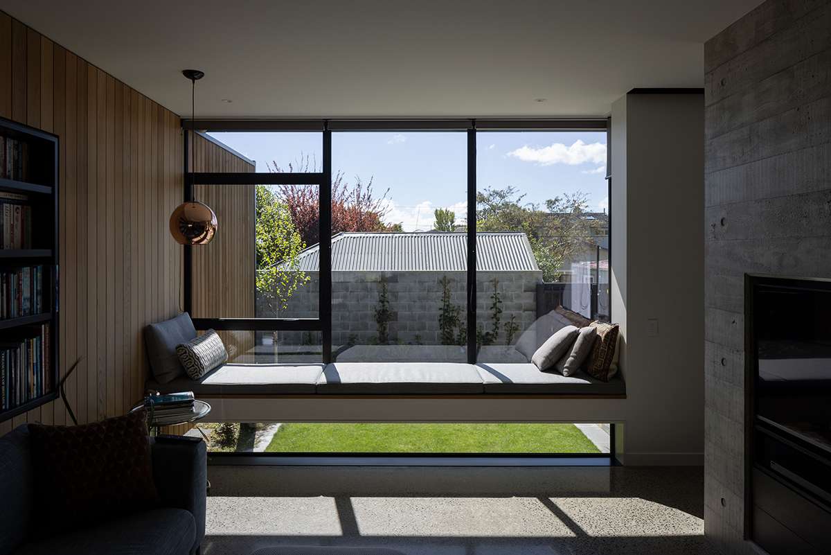
This floating seat in the den spans a wide corner window, with a sort of ‘no hands’ approach, allowing warm sun to seep into the concrete flooring below.
“The entry acts as a pivot space, where a concrete spine wall clearly delineates living and entertainment from sleep and utility spaces,” says Richard. “The volume here provides natural light and ventilation, drawing air from the building’s perimeter.”
You get out what you put into concrete elements such as the aforementioned spine and the fireplace in the living area, and considerable effort has gone into the making of those in this home. The result has a lovely haptic nature — “You can hardly resist touching it,” says Richard.
Clever separation of the house’s public zones makes the modest footprint work hard, with nooks off the open-plan living area dedicated to daily routines and pastimes; you can hole up in the office or step away to play the piano while still being within cooee of the kitchen. In part of the hallway, hidden doors set into timber walls open to reveal a powder room and storage cupboards.
Taking advantage of the north-west aspect, generous swathes of glass shroud the living space, alongside Metro Series stacker sliding doors that open onto a terrace. Supporting the pavilion aesthetic, horizontal eaves extend out to provide protection from the sun, and work in combination with the low-E technology of the tinted, double-glazed windows to maintain a comfortable interior environment while reducing the demand for additional heating.

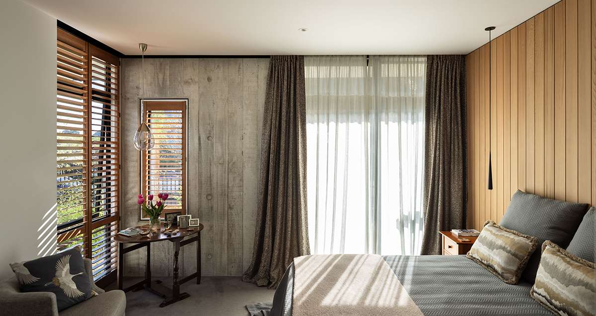
In contrast to the expansive joinery in the living pavilion, smaller windows in the bedrooms capture more intimate views of the planting beyond.
“Studio Pacific were also early adopters of warm roof technology in residential construction, which will become a more common industry solution,” says Richard. “It allows a more controlled internal thermal environment, which is easier and cheaper to heat.”
In contrast to the expansive joinery in the living pavilion, in the bed and bathrooms, smaller windows capture more intimate views of the planting beyond. “Striking a balance aesthetically, thermally and economically, First Windows & Doors provide a really good suite of windows to suit basically all circumstances,” says Richard. “Metro Series Thermal Heart are my current go-to for residential aluminium windows.”
All in all, this is a considered take on the modern suburban dwelling that sits comfortably within this neighbourhood. “Despite being a distinctly contemporary interpretation, the design maintains strong mid-century references in terms of scale, form and materiality,” says Richard. As much as it’s a job well done that suits its inhabitants perfectly, this home is a testament to the enduring qualities of an architectural style that puts people at the heart of the design.
See more of this home at firstwindows.co.nz/suits-you


